Related Posts Plugin for WordPress, Blogger...

1.30.2012

Entryway Progress: My Top Wallpaper Choices

With the entryway disaster behind me, I'm moving forward to get the walls in that space corrected and looking fabulous.  Thanks for all of your comments--I have renewed hope for grass cloth, should I go that route again.  Since I've been looking for the right wall treatment for some time, I revisited some of my original choices as I went back to the drawing board in search of a wall covering.

If money were no object........


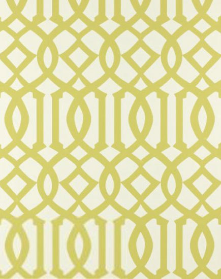
Imperial Trellis in Citrine would be my number one choice.  Everyone loves this pattern--in fabric and wallpaper--and I'm no exception.  Maybe its the graphic pop, or the combination of curvy and straight lines, or maybe its the striking repetition of pattern--whatever it is, this design is so interesting, and I love the acid green-against-white colorway.


I also came across this trellis pattern, which would be a great second choice to the Imperial Trellis:


Unfortunately, the paper itself is "thinner" than I think it should be for the condition of our walls.  We've patched them as necessary, but I feel I need something with more thickness to hide the imperfections I'm not seeing.  See more patterns and colorways from this collection here.

In  my search, I came across this and was drawn to it because of the light silver-gray color and overscaled pattern:


I took a quick photo when I was at the store, and neglected to write down the brand.  Needless to say, while I love the pattern and subtlety of the color, it has a metallic sheen to it that I think I'd get tired of too soon.

So after looking through countless wallpaper books, and really adoring so many of the graphic, colorful and interesting patterns out there, I feel like I just can't commit to anything too trendy for my entry and stairwell area.  If I was considering changing it out again in a few years, I'd definitely take the plunge and do something more fun, but since that's not the plan (WAY too many other house projects chewing into the budget), I'm back where I started......still wanting my grass cloth.


This photo shows the two new samples I found that are closest to what I have on some of the walls (my current grass cloth is the background).  The weave of the new ones is a bit more course, but I don't mind the added texture.  I think the top one is the one that will work best as it leans more toward a green-gray than a purple-gray like the bottom one.


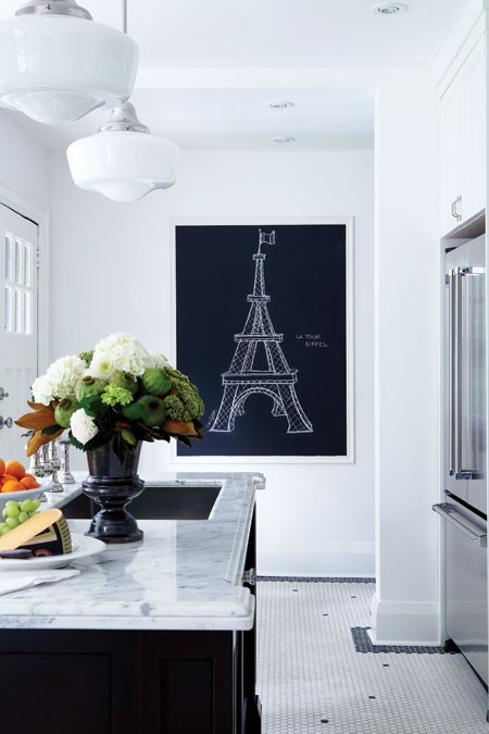
Grass cloth adds so much glorious texture to this room, designed by Frank Roop, and plays well with the other textures going on in the space.

So with all of the many books and patterns I've looked at (and there have been a ton), I'm sorry to say that I'm not more of a risk-taker with pattern and color.  However, I need to go with what I know I'll love in the long run, and my plan is to get the stuff on order this week!

1.24.2012

Entryway Progress & Grasscloth Disaster

A long while ago I posted these inspiration images for the walls in my entryway.  We've been living with this awful wallpaper for over two years now, and I'm dying to get rid of it.  You know how sometimes when you live with something long enough, you kind of get used to it and "forget" that its there?  Not with this stuff--it yells at me everyday:


It was discovered underneath another layer of paper that we immediately peeled off when we moved in.  This layer, however won't budge.  We've tried everything and even called in experts to have a look, and the verdict is that its not coming off.  In addition to that, the walls aren't in great shape, so I've been considering several options.  Either skim coat the entire entry and stairwell and prep the walls for paint, or cover it in a beautiful wall covering.  Wall covering it is--grass cloth to be exact.  I searched high and low for an affordable grass cloth, and when it seemed like I wouldn't find what I was after, I stumbled across the perfect color (and price) at Lowes of all places.  Its a gorgeous gray color, and nice and neutral with no weird undertones.  Plus, it has a very fine weave, and looks like a lot of the expensive grass cloths I've found in high end books.  After waiting five months for it to arrive (it was backordered), we had it installed last fall right before the baby was born.  As soon as it started going up, I loved it.  This photo isn't the best, but its an idea.


However, shortly into the process, things started to go wrong.  Keep in mind that all the correct adhesives were used, and the method for hanging used by my (experienced) installers was careful and meticulous.


I hope you can tell from the photos that every seam is completely bleached out and horribly visible. While I understand that one of the interesting characteristics of grass cloth is that the seams are visible once its installed, this was not the kind of "visible" that I was used to seeing, and obviously a product failure.  What's more, not only were the seams bleached, random patches in the middle of a sheet had lost color as well:


And the worst area:


Needless to say, after this started happening to literally every sheet that was hung, we stopped mid-process, and now the project is half done.  Lowes was great about it, and offered to replace all of the rolls I purchased with new ones if we wanted to start over and "hope for the best" with a new batch.  I was ready to take them up on this, and then found out that the product had been completely discontinued!  So back to square one.  Its now almost been a year since I started the process and I still have ugly walls in my entry, plus 40% of the walls covered in faulty grass cloth that has to be removed.

The silver lining?  I recently found several great new options for wall covering for the entry, and am ready to make a decision and get the project back on track.  I'll post my findings this week, and hopefully make a decision and get something ordered very soon.

Has anyone ever run into this problem with grass cloth before?  Its such a beautiful product, and so hot right now that I'm sure I can't be the only one.  Hopefully the second time is a charm with this project!

1.19.2012

Kitchen of the Week: Crisp Contemporary

Ordinarily, I'm drawn to kitchens that are either on the traditional end of the spectrum, or on the ultra-modern end.  I love the cabinetry detailing and craftsmanship that is so evident in traditional applications, and I also love a modern kitchen because it takes a delicate balance of line, scale and proportion to "get it right".  The middle of the road is where I struggle to find spaces that appeal to me--I'll call them "contemporary" kitchens.  The main reason is that often, contemporary kitchens look like a mash of every trendy material and finish currently out there, thrown into a space with the hope that because these things are "in", the space will look well designed.  When I stumbled on this award-winning kitchen, however, I was blown away with how well current materials have been used to create a space that is beautifully appointed, unique, and perfect for this home:


This space, designed by Lucy Penfield of Lucy Interior Design recently won Best in Show at the 2011 ASID (American Society of Interior Designers) awards banquet.  I think that the combination of elements, the application of current trends, as well as the careful attention to maintaining the home's integrity worked to create a gorgeous space with a ton of visual interest.  Here's my take on how this talented designer made everything really come together.

1  Neutral "grayish" palate
The "weathered look" with grayed-down wood tones and tactile texture is hot right now.  While this look often lends itself to vintage, antique or eclectic interiors, this kitchen is the perfect modern reinterpretation of the trend.  The smooth, flat-paneled wood cabinetry has ribbons of gray running through it, but is kept warm through complimentary beige tones in the wood.  Having the grain run horizontal on all of the cabinet fronts and doors adds to the contemporary feel, and maintaining a similar wood tone on the ceiling and floor creates continuity and flow in the space.


2  Extra thick countertops & waterfall edge detail
Increasing the thickness of a countertop is a great way to compliment the length and scale of a large island.  Typical stone and quartz composite countertops are 1 1/4" (3cm) thick.  For what's referred to as a "built up mitred edge", fabricators will mitre the top edge of the stone, and then add an additional mitred piece, anywhere from 2" to 6" to give the countertop its thicker look.  When done well, it will appear that the top is one thick solid piece of stone.  Wrapping the edge of the cabinetry and having this countertop run down to the floor adds additional mass, and the color chosen in this kitchen adds contrast, definition and prominence to the large island.

3  Mosaic tile backsplash
Glass mosaic tile seems to be available everywhere these days, and has lost a bit of its uniqueness because of it.  In this application, however, I love how the designer has been intentional about the tile's placement, choosing to highlight and transform an entire wall and bring another textural element to the space.  The contemporary nature of the tile lends itself to the design of the rest of the kitchen, making it "classic" within the space rather than a passing trend.


4 A kitchen that doesn't scream "I'm a Kitchen"
In my opinion, this is perhaps the most successful part of the design--this space blends amazingly with the rest of the interior, but also takes into account what's going on outside.  Its been designed to have unobstructed views in both directions, and because of this, some of the typical "kitchen" elements have been left out (in a good way).  Wall cabinetry is no where to be seen, which allows a large window to dominate one wall and bring light in.  Storage space is neatly designed into one of the corners, and the unavoidably tall appliances like the wall oven and refrigerator are placed at either end of the kitchen's perimeter.  With two large islands, there is certainly enough storage space, and keeping everything low creates an open, airy feel.  Even the presence of the cooktop is minimized, placed discreetly along the window wall with downdraft ventilation instead of a large hood structure.  Overall, this kitchen has the look of a true "living space" and is highly functional as well as extremely inviting.


I also have to say that I'm in love with the fixtures and furnishings in this space, and those counter stools were what drew me in to the space in the first place.  Along with those fabulous light fixtures, they add a playful, modern element.  With seating for six, gorgeous views in every direction, and an interior this beautiful, who wouldn't want to spend every sunny summer day at this lakeside retreat?  Count me in!

1.16.2012

Art in the Kitchen

I've been staring at a blank wall in my kitchen for over two years now, tossing around several ideas of what to do with it.  In one of my concept layouts I had cabinetry along that wall, but in the end the design took a different direction and the wall remained as it was.  I know I need to do something there (see photo below--the wall in question is to the left of the fridge), and I think a great piece of art, or arrangement of pieces would look great, but that's where I haven't taken enough time to find the perfect solution.


I think that wall art adds an element of the unexpected in kitchens.  Often in kitchen design, walls are consumed by cabinetry, windows, open shelving, tile, etc., and there is little space left for anything else.  Either that, or kitschy (sometimes cheesy) art prints of food, fruit or wine end up being hung on blank walls to occupy the void.  So is there a happy medium--a place for great artwork in the kitchen that doesn't come across as too literal?  I hope so, because that's what I'm looking for.  Here are some great "art in kitchens" images I found as I started the search:


I absolutely love these prints, and even though they are very literal, their style makes them unique and very appropriate.  I like how they add a modern pop of color to a more traditional setting.

Canadian House & Home

This large floral painting by Bobbie Burgers looks like it was not only planned into the space, but gave inspiration for the design direction as well.  I love how it connects the outdoors, the yellow range, and the rusticity of the island table and makes everything look so cohesive.

Pinterest

Again, this is a literal take on something found in the kitchen, but the application makes it unique.  Its size and scale is unexpected in this tiny kitchen, and the high contrast is perfect with the existing color scheme.

Canadian House & Home

Keeping with the black and white theme, this framed chalkboard looks classy and compliments the kitchen's scheme.  Additionally, it becomes a forever-changing piece of art.  Great idea.


I've tossed around doing a collection of family photos on my blank wall, but thought that there wasn't enough context for it in the space.  However, this dining corner is perfect for the gallery of photos, and I love how the frames are eclectic and carried up over the window.


I've posted this kitchen before--its always been a favorite of mine.  Designed (and lived in) by Canadian designer Lynda Reeves, I like how she's added framed abstract art right next to the range hood, and then repeated it again over a desk in the corner.  The artwork brings a sense of sophistication to the space.

Pinterest

This vintage sign is also a clever idea, and is non-traditional and unexpected in a kitchen space.

There are a ton of ideas out there, and I also did a short search to see what other "unconventional" pieces might be interesting:


Vintage botanical prints


Not-so-vintage (but very affordable) framed botanicals from West Elm


Affordable framed abstracts from West Elm


Original art hardware drawings from Restoration Hardware (there are over 1000 to choose from!)


I also love this vintage eye chart--it would add a nice graphic punch to any wall.

Well, those are my thoughts for now.....I'm not sure I've figured out the perfect solution, but at least I've started thinking about it.  I'm tired of staring at that blank wall!

1.12.2012

Kitchen of the Week: Beautiful Brass

Since being off of work with a new baby, I've missed getting my usual dose of pretty images related to kitchen and bath design.  I'd like to get back into it slowly, and I thought that a good way to do so would be to feature a different kitchen and/or bath each week and focus a discussion around different trends and ideas that we're seeing right now.


This kitchen, designed by Minneapolis-based designer Alecia Stevens caught my eye a while ago.  At first glance, it is a beautiful and well-balanced space, but as you look closer, there are many current trends integrated into the design.  The word "trendy" can often be perceived as negative, since it is the goal of so many designers and homeowners to have "classic" spaces that will maintain a timeless look.  Good design, however, has the ability to take a trend (however risky), integrate it into a room and almost transform the trend into looking timeless within its surroundings.  I think this kitchen takes four major current trends and does an amazing job of making them work.

1  The "White" Kitchen
White kitchens are extremely popular right now, which would qualify them as "trendy".  People ask me all the time if there's a risk associated with going with a white kitchen just because they're popular now, and I almost always say no.  First of all, if you love white cabinetry (and its right for your house), this is absolutely the direction you should go.  Second, white kitchen cabinetry has made an appearance in every decade for the past hundred years, so its not unique to this time period and should hardly be termed "trendy" for the 2000's.  Besides, its most often the style of cabinetry that gives away the decade a white kitchen came from, not the colour.

2  X-Detailing
The above kitchen uses x-mullion detailing on the refrigerator door and the cabinets on either side of the range.  While this type of detailing is showing up in a lot of places right now (and has for a while), this space utilizes the design element sparingly yet effectively.  A couple more examples of nicely integrated x-detailing:


Love, love, love this kitchen!  And isn't the integration of the x-detail at the end of the island genius?

3 Antique brass fixtures and hardware
This trend is huge, and has the ability to add the element of the unexpected to a space.  I would consider it to be somewhat risky, but again, if used properly can add warmth and patina to a room.  I think fixtures (lighting, plumbing, etc.) and cabinet hardware are great places to play with trends because they aren't impossible to change out down the road.  In the case of those brass light fixtures, I couldn't see myself ever messing with them--their scale and colour adds so much to the room!  Plus, look how this element has been carried throughout other areas of the home:


4  Patterned tile
Kitchen backplashes often fall victim to passing trends.  Either that, or they seem to be areas where designers and homeowners get over-creative and pull in odd combinations of accent tile, mosaics, etc. and actually take away from what's happening in the rest of the kitchen.  Not the case here.  This is a perfect example of how to use an intricate and unique tile, and make it a feature that doesn't dominate the space.  The key is that the tile was applied as a full height backsplash, and only one pattern was chosen.  There are no annoying borders or insets, and the repetition is what creates drama and impact.  


Same with the floor tile.  The black and white is uncomplicated, classic, and provides a beautiful transition into an adjoining room.  Plus, it subtly echos the x-pattern on the cabinet doors, giving it context and purpose.

So what do you think?  Does this kitchen score points for its marriage of "classic" and "trendy"?  Click here for more photos of this entire home.  I could move in to this space tomorrow!  

1.10.2012

House of Turquoise

Just wanted to take this opportunity to thank Erin at House of Turquoise for featuring Tate's nursery on her blog today.  I was honored to have so much positive feedback, and even more delighted that she chose to feature it.  Its special to me to be featured on House of Turquoise since it was the very first design blog I ever discovered, and the only one I followed for a long time.  I stumbled across Erin's blog about three years ago when I was looking for inspirational kitchen photos. When I got there, I found a lot more than beautiful kitchens, and had so much fun looking through the collection of gorgeous interiors.  I knew immediately that Erin had great taste and an incredible eye for good design, and checking in with her blog every morning became just as regular as my morning coffee.


Since then, she's gotten well-deserved recognition (I was floored when the editor of House Beautiful magazine gave her blog a shout out last year!), and continued to search out and display countless beautiful interiors.  I'm sure many of us have come to call turquoise our favorite color because of her blog.  So thanks Erin, for your commitment to what you do, which is inspiring thousands of readers and design aficionados everywhere, and perhaps opening doors for little known designers (like me :)) to do more of what they love and be an inspiration as well.

1.08.2012

One of These Things is Not Like the Other

All good things must come to an end, and this weekend marked the official stripping of the Christmas decorations from my house.  I'm sure I'm at least 2-3 weeks behind most people, but I had to wait until at least after New Year's, then threw in another week for good measure :)  Plus I think the Christmas tree really fills in that corner of the living room nicely, so I wasn't too eager to get rid of it.

Since we got married, my husband and I buy a new penguin ornament each year as part of a little tradition we started.  Penguins mate for life, so we thought it was cute and fitting to add to the tree with a new little "mascot" every Christmas.  I showed our collection here last year, and I was eager to start the search for our official 2011 ornament.  I had to chuckle as I was pulling all of the ornaments off the tree this weekend--I'd had some trouble finding a penguin this season, but my husband had come home from Christmas shopping one day, proud to show off his "find" for the tree.  Can you tell which one he picked?


Seriously.  One of these things is definitely not like the others.  At first I didn't say anything because I was so impressed that he took the time to search this little guy out, and then stood in line for fifteen minutes to pay for it.  Then, I gently suggested that maybe it didn't quite 'go' with the rest of the tree.  He agreed, and said I could do whatever with it, he was just trying to help out.  If you've seen my Christmas tree, you'll notice that there's no way this chubby creature fits with the rest of the theme, but over the course of the season, he kind of grew on me.  So I decided that this would indeed be our 2011 mascot, and in future years I could just hide him in the branches somewhere :).  Of course after the fact, I did manage to get my hands on two penguins, one with a silver tummy, and a frosted one that my mom gave me, both much more suited to my decor.  Oh well--I think a little bit of humor this year adds nicely to our tradition!

With all the Christmas boxes now neatly packed and tucked away for next year, I'm looking forward to a few giggles when I crack open the decorations next year.  The living room does look so empty though......what to put in that now empty corner where the tree was......?

1.04.2012

A Resolution to My New Year's Resolutions

Every time the New Year comes around, I go over my mental list of the things I'd like to accomplish and ways I'd like to better myself as a person.  And every year when it seems like I'm not "on track" for accomplishing those things, I beat myself up and play the comparison game with others, falling into the thinking that I'm somehow not good enough, organized enough, or smart enough to complete my "list".  So this year, while I am resolving to make some improvements, I'm also (more importantly) resolving to be easier on myself, accept my limitations and take pride in the things I do accomplish.

I think its so easy to get to a place where we decide that since we can't do it all, we can't do anything.  With a world of beautiful blogs written by talented bloggers, we see projects, homes and interiors that look polished and professional, and make the people that live in these spaces look like their homes are picture perfect all the time.


Magazines and print media give us gorgeous spaces, presenting a lifestyle that we dream about living in.


images via Canadian House & Home Magazine

Pinterest, a grand distraction full of great ideas, allows us to create boards full of projects, recipes and inspiration.........it would take me years to complete all of the things I've pinned!  Although I love this idea for a clock--its totally me!


Anyways, my point is that we (me) beat ourselves up over how much it looks like others are able to accomplish without realizing that the pretty pictures only tell half the story.  In reality (and I hope other bloggers can attest to this), for every beautifully photographed room, there's a not-so-pretty pile of stuff down the hall, or in the corner the picture doesn't show. For example, at the same time my new kitchen looked like this:


The guest bedroom on the other side of the wall looked like this:


And I won't even get started on all of the other "hoards" I have in various rooms of my house...... :)

Those gorgeous rooms we see in magazines and designer websites don't tell the whole story either.  It takes a team of talented designers, fabricators, installers, photographers, stylists and editors to create the lifestyles those spaces impart, and they certainly didn't come together overnight.


So this year, I'm determined to be ambitious, but also realistic.  I'm aiming to stay grounded by keeping things in perspective, applauding my accomplishments and not beating myself up for the inevitable failures.  Overall, I'm looking forward to good things, great changes and challenges, and a year full of success.

All the best for a wonderful 2012!