A long while back, I posted here about a fabulous client before and after project that I designed last year. I've been waiting to get it professionally photographed, and the time has finally come--the photos are in! This project is a career highlight for me, both in the transformation of the space, and in the great relationship and collaboration I was able to have with these clients. I truly believe that a successful project is the result of good communication and an honest working relationship, which I felt I had with these wonderful, stylish and intelligent clients! Here's a look at what the space was like when my clients purchased the home--it was dated, segmented and related poorly to the rest of the home:
And here is the new space:
In designing this kitchen, along with reworking the back entry, staircase, and the guest room hallway, we looked at many different floor plan options before settling on this one. Usually I like to present clients with a few different design scenarios so they can see what could be, and in the end, what works best for their space and their needs. Here's my take on why this design works best, and why I think it will serve the home and the homeowners for years to come.
1 Open, but not too contemporary
I definitely think there's an urge these days to create open and free-flowing space within a home. In many cases, this can dramatically improve the everyday use of the space, the way that family interacts and congregates in the home, and the way homeowners are able to entertain guests. Older homes are notorious for having kitchens that are completely cut off from the rest of the home, and while these spaces often benefit from being opened up, the temptation to get rid of all the walls and create one large room can prove disastrous in a period home. In this space, we combined two smaller rooms to create a kitchen and seating area, and also opened up the wall to the dining room. However, the addition of trim and casing that matches the rest of the house defines the new opening, making it look planned and part of the original design--not like we just cleared out all of the walls for the sake of a more open floor plan.
2 Material choices that read as "period-appropriate", rather than "on trend"
With this home being built in 1931, we wanted to incorporate modern convenience and good design sense while still respecting the age and character of the house. A typical 1930's kitchen (in its original state) might have had painted cabinets, but for this space we took our cues from the warmth of the original dark wood mouldings and trim, as well as the natural oak floors. The cabinetry is natural cherry, which is a lovely wood species to use because it marries well with other wood tones in the space. Cherry also mellows and darkens with age, and over the years will develop its own beautiful character.
Another period appropriate material choice are the soapstone countertops. Soapstone has been used for centuries as a durable surface for high-use areas. It is non-porous, so won't stain or trap bacteria, and is so resistant to chemical abrasion and acidic foods that its a preferred surface in chemistry labs. Plus, it has a natural, organic beauty, and no two slabs are alike. A classic element is also found in the backsplash, which is composed of elongated subway tiles that pick up on the beautiful green hue in the soapstone.
3 Floor plan that emphasizes style and function
A successful part of this design is the way that the layout works well for two or for twenty. The kitchen is essentially a galley style, with the sink, range, and refrigerator placed adjacent to, or directly across from one another. A large island allows for comfortable prep space when two people are working in the kitchen, while the seating and additional beverage center/buffet create another work area for the homeowner, and keep guests out of the main prep space. The gentle curve of the island adds an element of modernity, while naturally guiding traffic toward a comfortable seating area at the other end of the room--a space designed to enjoy a morning cup of coffee, or casual conversation while entertaining friends.
So that's the tour! I could go into much greater depth about all of the details and planning that went into making this space a success, but I'll let the pretty pictures speak for themselves. As I mentioned before, this is a most favorite project of mine, and I hope it results in many great years of good living for these wonderful clients.
2.29.2012
2.24.2012
Try it Before You Buy It: Chalkboard Wall
Chalkboard paint is widely used right now on anything from accent walls to entire rooms to furniture pieces. Although, I think that this is a passing trend, and that perhaps we'll look back on it someday and wonder what we were thinking, I have yet to come across a home interior with a chalkboard wall or two that I didn't love. In practicality, I'm bothered by chalk dust, and even more bothered by the sound of nails on a chalkboard.....I have shivers right now just thinking about it, but I'm willing to overlook those two major factors because I want some chalkboard action in my own home.
So with all of these great inspirations and examples, I'm now itching try this in my own space. However, I have a track record of painting every room twice because I'm seldom satisfied with my first choice, so I decided that instead of going to the trouble of painting the wall and not liking it, I'd do a little (ghetto) mock up before I commit to the time and effort. Here's the wall in my back entry I'm wanting to paint:
And here's my lame (aka $3 pack of construction paper) attempt at "visualizing" what the black chalk paint would look like:
At first, it was overwhelming to me, but its been up for a few days now, and I'm liking how it kind of brings that wall forward and into the room. Its a large and bossy expanse of black, but I think I need a place that allows me to write messages and reminders in a big and bossy way. The baby takes up most of my brain space these days, so having constant visual reminders of what needs to be done, purchased, dealt with, etc. is key. A trip to the paint store might be in my near future. We'll see........:)
This rustic-modern interior is beautiful, and the injection of a mass of black really sets off the white fixtures and furnishings in the room. How much cooler that the chalkboard itself is actually a huge sliding door? Smart, smart, smart.
The stark stainless and white tones of this kitchen are offset beautifully by the contrasting black wall. Plus, it adds an element of whimsy to this modern, clean lined European kitchen in that the art has an organic and ever-changing element to it.
I love how blogger Carmel of Our Fifth House blog addressed this small section of wall--so creative! And she went the extra mile by using magnetic primer under the chalkboard paint so that the wall could serve in that way as well. I'm considering that as an option myself, since I have a stainless steel fridge that magnets don't stick to. Then I remember that I LOVE the fact that magnets don't stick to and clutter up my fridge, so maybe the magnetic option for this wall isn't for me. We'll see.
A simple and effective way to add interest to a small space.
So with all of these great inspirations and examples, I'm now itching try this in my own space. However, I have a track record of painting every room twice because I'm seldom satisfied with my first choice, so I decided that instead of going to the trouble of painting the wall and not liking it, I'd do a little (ghetto) mock up before I commit to the time and effort. Here's the wall in my back entry I'm wanting to paint:
And here's my lame (aka $3 pack of construction paper) attempt at "visualizing" what the black chalk paint would look like:
At first, it was overwhelming to me, but its been up for a few days now, and I'm liking how it kind of brings that wall forward and into the room. Its a large and bossy expanse of black, but I think I need a place that allows me to write messages and reminders in a big and bossy way. The baby takes up most of my brain space these days, so having constant visual reminders of what needs to be done, purchased, dealt with, etc. is key. A trip to the paint store might be in my near future. We'll see........:)
Labels:
projects
2.17.2012
When is a Chair Not a Chair?
This month's House Beautiful Magazine was a wonderful little indulgence for me. I get excited seeing page after page of things that are "the same but different". In this case, it was the color green, and there was so much eye candy in this issue. I was immediately drawn in by the chair on the front cover:
Which is this chair from this company:
Which is this chair from this company:
This type of chair has been wildly popular lately, and when I first saw a pair of these in one of Kelly Weartsler's interiors, I loved them for their quirky beauty. The look of them totally transports me to another era--kind of Sherlock Holmes-y.
.
Then they started cropping up in mainstream retail home furnishing stores:
.
I'm sure like me, many people are curious about what it would be like to have one of these chairs in your home. That's why I had to laugh when a couple of months ago, one of my favorite (hilarious) evening sitcoms, Rules of Engagement, dedicated an entire episode to making fun of these chairs.....and they raised an interesting point.
The whole episode is an arguement between Jeff and Audrey when Audrey orders "the chair", actually hates it but pretends to like it to avoid an "I told you so" from Jeff. They engage in a hilarious battle of wills, and end up with two of these beauties--watch a clip from the episode here.
The point they were trying to make was that this chair didn't really function as a great chair should, and wasn't a good marriage of style and comfort. So when is a chair not a chair? When it looks like a time machine and functions like a phone booth (Audrey had to call Jeff from her cel phone even though they were sitting right next to each other :))
Nevertheless, I still love the look of these beasts, and am more curious than ever to sit in one and see how it feels. A quick trip to Restoration Hardware might be in order--I'm sure they have several!
2.14.2012
Happy Heart Day
I wish I were more into Valentine's day in terms of decorating, romantic stuff, etc., but I've never really embraced the "holiday" that much. Even so, I thought I'd post a few pics I came across that I just LOVE, and think they relate beautifully to this little Heart Day without being too predictable.
JC Penney launched a great new branding and advertising campaign this February. Their latest ad showcases their new "look", and I love how they've breathed a new freshness into what was becoming a bit of a stale department store. I'm especially fond of the graphics in their ad, like the one above for Valentine's jewelry. I would never buy any of that stuff, but when its all grouped together like that, I just might take a second look. And I would love to have the time to arrange my underwear drawer like this:
A quick search on Pinterest turned up these adorable little heart compositions:
And I got the biggest smile on my face when I found this most creative collection of art piece/images by the talented Leslie of A Creative Mint. Delightful!
And there's more of these! Click here to see them!
Hope you have a special day with whomever you're sweetie is! And even though I said I don't really "get into" this spirit of Valentine's, here's a peek at me and my forever valentine......I love you J.
Labels:
Holiday decorating
2.09.2012
Do You Like this Kitchen?
If you ask me, Canadian House & Home magazine is one of the best design magazines available today. This isn't a plug for my Canadian heritage, or a bias because I'm from that country, but I do think that this publication showcases some of the best and most beautiful when it comes to residential interiors across Canada. What I like about the magazine is that they feature spaces that are high-style, high-end and impeccably pulled together, but still manage to appeal to the average homeowner and design enthusiast. It takes a team of talented editors to create a resource for design professionals while still inspiring the everyday homeowner, and I think this magazine does a great job of it.
Every year, they feature a tour of the Princess Margaret Showhome, and I have absolutely fallen in love with some of the kitchens in those homes (designed by the House & Home team). In 2008 they pulled together this classic-meets-weathered look that showed off current trends while still maintaining a classic aesthetic:
Every year, they feature a tour of the Princess Margaret Showhome, and I have absolutely fallen in love with some of the kitchens in those homes (designed by the House & Home team). In 2008 they pulled together this classic-meets-weathered look that showed off current trends while still maintaining a classic aesthetic:
And in 2009 produced this to-die-for modern meets country kitchen--so many unexpected, yet perfectly executed elements:
So with a history of loving the kitchens in these homes, I have to say that I'm not over-the-moon with the most current one from the 2011 showhome:
As a kitchen design professional, I'm always on the lookout for current trends, whether it be a new and innovative material for surfaces, functional hardware that allows for improved useability, or interesting colour directions for the kitchen space. I hope I'm not coming across as totally clueless or style-less when I say that I can't quite embrace the abundance of "mustard" happening in this room. While the colour tone itself is quite beautiful and there are other elements in the space that I love, such as the range/hood combination, stone floor and rustic work island, for me, the colour is just too much of a good thing.
I do love the dresser-style hardware on the base cabinets, as well as the grandness that's achieved by taking the wall cabinets all the way up to the high ceilings. And I do appreciate that they committed to the ochre color in its primary state without gobbing it up with glazing or distressing. I want to know what other people out there think though.....am I the only one struggling with this "new" design direction? Opinions please!
Labels:
Color,
Kitchen design
2.06.2012
Humor in the Kitchen
Like many of you this past weekend, we spent the Superbowl with friends, enjoying an evening away from the house in the company of people we like. When I say "we" watched the Superbowl, I really mean my husband because I have zero to no interest in football whatsoever. In order to make the event tolerable though, I like to spend some time in the kitchen preparing goodies that can be enjoyed during the game. I take my role very seriously :), but this year my plans didn't go as planned.....
I picked up this Nordic Ware stadium pan a few years ago on super sale, thinking it would be perfect for a theme cake for a sporting event. I tried baking a cake with it once before with disastrous results, but had renewed hope in myself this year, and tried once again. The pan came with an image of what the finished cake could look like:
Very cute. Mine looked like this:
My husband called it "post-apocalyptic", and I just laughed at the disaster that I'd created (once again). My three month old even started giggling as I was trying to shake it loose from the pan.
With two failed attempts at this cake, the pan might be relegated to our garage sale pile for the spring, but we'll see. Or I could ask my expert sister-in-law, who runs a successful wedding cake design business, what the perfect recipe would be for a cake that actually comes out of the pan properly. I'm embarrassed that she even has to see this cake disaster :) There are two bits of silver lining though.
Spray icing in a can:
I bought this to decorate the stadium cake with. However, when the project failed, it worked great to take a handful of broken cake, cover it with a generous spray of icing-in-a-can, and eat away my sorrows in the form of chocolate cake. So much for the post-pregnancy diet this weekend :)
Heath Bar Trifle:
This is the best-tasting and most impressive recipe to use when your cake is ruined. I've done it many times, in many forms with different ingredients, when anything from box cakes to angel food cakes have failed. Here's the chocolate version:
1. Bake a chocolate box cake and once cooled, cut into cubes (or in my case, use the pieces that are already broken). Take a large bowl--a glass one works nicely--and layer cake on bottom.
2. Prepare 2 boxes of chocolate pudding according to the package instructions and layer 1/3 of the mixture on the cake.
3. Spread a layer of Cool Whip on top of the pudding and sprinkle with Heath Bits (or crushed up Skor bars in Canada :))
4. Repeat these steps twice more, and voila, an impressive and large dessert for a crowd.
And no one will ever know the disaster that had to happen to create this masterpiece. Enjoy :)
Labels:
Recipes
2.02.2012
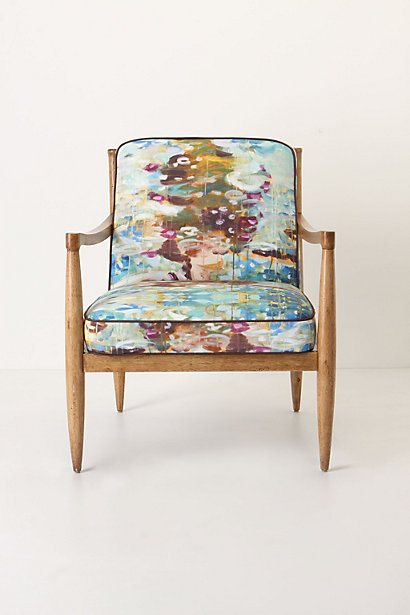
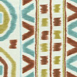
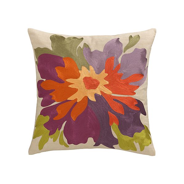
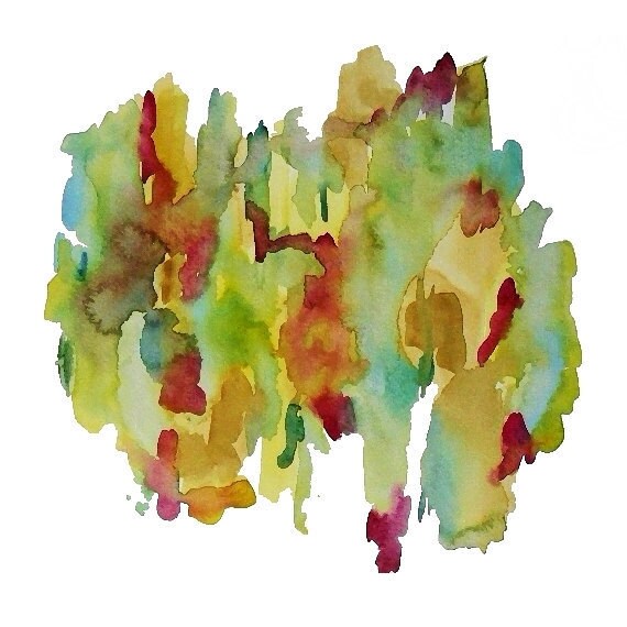
The Watercolour Trend
My January issue of Canadian House & Home magazine informs me that one of the top trends trickling down from the runway to home interiors is watercolour. I'm happy that some of my design sources tell me what's fashionable in clothing right now, because these days I've chosen to remain completely clueless about what's up and coming in the fashion world. Its a self-preservation technique, really, because during my pregnancy, I gained 50 pounds, and while I've dropped 40 of it over the last 3 months, the last nasty ten needs to go away before I can start getting excited about new clothes again. So while I'm certainly not filling my closet with any of the latest trends, when it comes to home decor, one size fits all, and I'm loving all of the watercolour-inspired items starting to appear.
In furniture:
In furniture:
Bedding:
Housewares:
Floorcoverings:
source
source
source
Textiles:
source
I also did a quick search on Etsy, and there's an infinite number of original watercolor paintings--perfect to compliment all of the other popular decor:
And if I do manage to ditch the pregnancy weight soon, maybe I'll get in on the fashion trend (before it goes away) and sport one of these pretty dresses:
That's all I've got for now, but I'm going to keep my eyes peeled as this trend continues to emerge in home decor. It think a hit of watercolour--in furnishings, a painting, or an accessory could be the perfect thing to soften the edges of any room. Happy Friday, and have a great weekend!
Labels:
Trends
Subscribe to:
Posts (Atom)


.JPG)


.jpg)
.jpg)
.jpg)

