Related Posts Plugin for WordPress, Blogger...

10.05.2011

Why Does Everyone Want a White Kitchen?

I haven't chatted about kitchen design for a while now, and since the arrival of a new bundle (of joy!) will probably take center stage for the next little while, I wanted to take the opportunity (while I have it) to talk about something career-related.  White kitchens have been "on trend" for a while now, and they seem like the right choice for so many interior spaces.  Besides the obvious though, why is it that this is now the go-to for homeowners and designers alike?


1.  Designers are still excited about white.  When I see a beautiful white kitchen, my heart beats just a little bit faster.  When clients come to me asking for white kitchens, I never tire of the request, and look forward to pulling together all of the elements that will make their "white" kitchen a success.  I'm not even sure I can pinpoint an exact reason, but I think it has something to do with white's ability to be the perfect backdrop, while at the same time being the star of the show and setting a tone for the entire space.


2.  Everyone wants what everyone else has.  While I realize that this is a major generalization, I do see the "white" trend driving more of the same trend.  This look probably won't be popular forever, but for the moment it has a captive audience that continues to breed more and more interest.  But really, who wouldn't want to live in this white-on-white kitchen pictured above?

Pinterest/Kitchen designed by Mick de Giulio

3.  There's a sense of the "non-committal"--in a good way--when you choose white.  In a way, white is the perfect choice for those who are afraid to commit to a color or wood species that they might tire of in a few years.  However, instead of defaulting like we sometimes do by painting all of our walls white because we're overwhelmed by all of the choices, white kitchens don't have the yawn factor that white walls can.  There's so much opportunity for layering of textures and materials in a white kitchen (think glossy white backsplash tile with silky smooth honed marble countertops), that the end result is anything but monotonous.  Add to that the dimension and depth you get from paneled doors, moulding details and wall paneling, and an all-white kitchen can really come alive.  Now the only choice is what shade of white to go with.......:)


4.  White is versatile and complimentary, making it easy to transition to other colors and finishes.  I love the kitchen pictured above.  It has an abundance of lightness and brightness, definite injections of white, but is perfectly balanced by the addition of that gorgeous smokey charcoal color.  In the same way, white can be the perfect partner if your mood changes with the seasons and you like to incorporate bold shots of accent color.  It allows you to experiment with different colors, wood species and finishes, and add a dose of something different without completely straying from classic white, like in the kitchen below.


5.  With white, you have the opportunity to inject the unexpected, and have it really stand out.  Because white is so common right now, spaces that incorporate white with some more uncommon elements can really steal the show.  This kitchen above is one of my all time favorites--the white cabinetry and coffered ceiling are beautiful in and of themselves, but also provide the perfect backdrop for those steel-framed french doors--they punctuate that back wall and guide my eye easily through the space.  The herringbone pattern on the floor is another unexpected element, and really elevates this kitchen to a level of high design and well thought out detail.

There you have it.  My thoughts on why white continues to be the new white :)  How about you?  What reasons do you have for choosing a white kitchen?

10.01.2011

Getting Close......A Nursery Sneak Peak

With only two weeks to go in my pregnancy, I'm getting so anxious and excited to meet our little guy, and the "nesting" stage has completely taken over.  The baby's nursery is almost complete, with only a few finishing touches yet to be added.  Here's what's been happening over the past couple of months:


Maternity photo shoot.  My husband's idea, not mine (I wasn't too excited to capture my larger-than-life state on camera).  Fortunately for us, our photographer worked magic, the shots turned out beautifully, and I'm so glad we did this. If you're in the Minneapolis/St. Paul area, check her out here for a beautiful portfolio of work.  I'm excited for the newborn photo shoot in just a few weeks!


To cover up an odd square recess in the ceiling, I used this oversized drum shade, embellished it with orange ball fringe and added some cute little whales to the inside--they'll glow through nicely when the light is turned on.


We went to the east coast and spent some time in Maine this summer for a little "babymoon".  These lobster buoys are the perfect colors and remind me of our last little trip together as a two-person family!


Love this whimsical, yet elegant whale pillow from West Elm.


You can see the fruits of our labors on all of the walls in the nursery.  Mr.CottageModern and I spent a good chunk of weekends this summer adding board and batten paneling to the perimeter of this room.  It turned out really nicely for a couple of rookies!  The map letters I made tie in well with the different shades of blue in the room.......we've had lots of guesses on the name of this little guy based on those two letters!


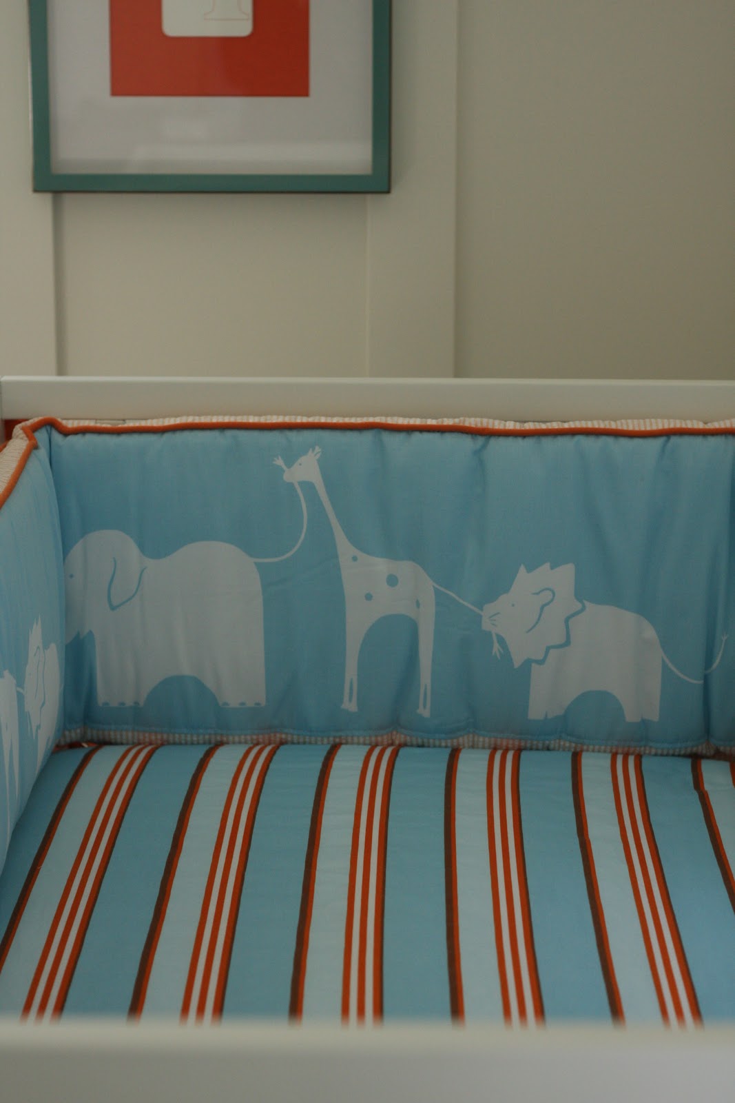
I'm really pleased with this bedding from Serena & Lily.  I agonized over keeping it because the blue is very "blue".  Not aqua/turquoise at all like I was hoping.  I was disappointed at first, but its so well made and adorable that I decided to make it work.  Its tying in beautifully with all of the other touches, so I'm happy designer again :)


Can't forget Sophie--a staple toy among all babies, so I'm told!


There are some great built-ins in this room that were original to the house.  I painted the backs of the open shelving turquoise, and have had fun accessorizing with toys, books, and of course the mini Air Jordans that my husband "had to have" for our little guy.  He has a matching adult pair in his size.  Pretty cute, I have to admit :)


So that's the nursery tour for now.  I'll post some more shots in the next few weeks.....maybe after the name is revealed!  This weekend's task list involves creating some drapes for the windows, so hopefully this very pregnant lady can muster the energy!

9.21.2011

Client Project: A Fabulous Before & After

A while back (a long while!), I posted here about a client kitchen project that was in the works.  The kitchen remodel has been complete for a while, and I finally got around to taking some amateur "scout shots" of the space.  I wish I could share professional photos with you (those are in the works), but I'm so excited about how this turned out that I couldn't wait to get these pictures up.  I do need to say first that I believe a large portion of the success of this project is the wonderful clients I had the privilege of working with.  They were the perfect balance of stylish, receptive, intelligent, and realistic with their expectations, and I loved the working relationship we had.  My hope is that they'll enjoy this kitchen for years to come, and that I'll get to work with them again in the future!

Here are a few before photos of their space:


 The main space was cut up into three side by side rooms--a dining room, small kitchen and bedroom at the back.  The house had also been used at one point as an "apartment-style" space, so there was a back staircase that was disconnected from everything, but needed to be integrated to make this a practical single-family dwelling.  The design took the three separate rooms and opened everything up into one large, long area.  We managed to fit a nicely proportioned island, and create zones for cooking, prep, as well as serving.  The back staircase was opened up to the rest of the house, and it now integrates beautifully with everything else that is going on.  Here's how it turned out:


The major challenge here was to create a functional cooking/eating/living space while maintaining the integrity and charm of the 1920's home.  Open floor plans are not always the best solution, especially in older homes, but it works here because we've maintained some doorways and divisions that help each area feel distinct, but still open to one another.  Additionally, materials like natural cherry and soapstone speak to the age and aesthetic of the house, and tie in beautifully with the original dark woodwork.


Overall, this project turned out better than I could have imagined.  There are still some finishing touches to be installed (like FABULOUS backsplash tile--stay tuned!), but as a whole, I think the design is a success, and the homeowners are happy, which is the true goal of any designer.  Again, my apologies for the less-than-desirable photography.....I'll update once we get a professional in there!

9.15.2011

Black & White & Wood All Over.........and Some Exciting News!

The injection of rustic elements into a clean modern space continues to gain popularity and be seen everywhere.  Maybe its the unexpected pairing of clean lines with rough finishes that makes it so appealing, or maybe its that we're ready (and have been for a long time) to see interiors that aren't so matchy-matchy.  Currently, I'm drawn to the stark nature of black and white, paired with warm rustic wood and driftwood tones.


Love how this second image marries the very modern with those industrial, vintage chairs.  Such an unexpected mix, especially with that stone floor.  It all works, and is refreshing instead of stark.


This relaxed, but beautiful space uses a "colorless" backdrop to showcase and highlight various wood tones and textures.  It mixes the perfect with the imperfect so well, and looks very comfortable to live in.  Check out more great photos of the house here.


That pine ceiling has such a cottage-like vibe, but when paired with sleek surfaces, that great modern hood, and those architectural window coverings, there's a nice harmony here.

via Pinterest

Love some of the details in this kitchen--the natural rug against that gloss white floor, the leather pulls on the drawers, and the casual rustic cabinet for open storage of dishes.  The look is gracefully unfitted, and it works well.


I've seen this kitchen in many different places and can't get enough of it.  The strong, dark outline on those island pieces punctuates the space, while the rough-hewn beams flanking the doorway and grey-washed floors add a casual softness.  


And in other news........a certain other kitchen with some black and white tones of its own got a bit of recognition this week:


I revealed my own kitchen a while back, and got some great response.  On a whim, I entered it in a state-wide design competition, sponsored by the National Kitchen & Bath Association.  I'm pleased to announce that it took 3rd place in its category!  Maybe to some people, third place is the "second loser", but given the criteria and the other kitchen designs I was competing against, its a proud moment for me, and I'm thinking this space is truly "the little kitchen that could".  There may be some magazine recognition for me in the near future, so I'll let you know if that happens!

9.07.2011

An Original Take on an Unoriginal Idea

I've officially entered the "nesting" stage of my pregnancy.  Actually, with all that's been going on around our house I feel like I've been nesting for months, but now things are in high gear.  My latest project has been creating letters to spell out our son's name somewhere in the room.  Everyone does this, and although I'm not sure what the reason is (the baby can't read), I love the look of bold graphics and lettering, so I wanted to do it too :)  I found these letters, and although I liked them, I thought I could do a better job and make them more personal.  So an unoriginal but interesting idea was born.

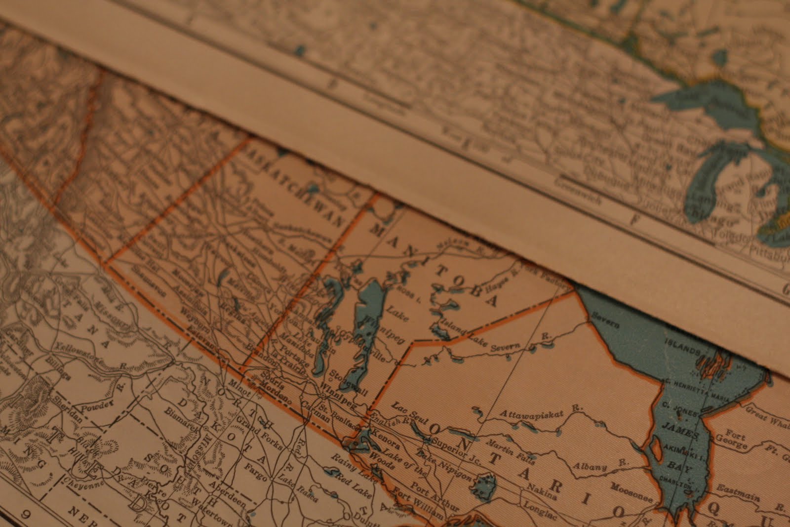
I thought it would be neat to create letters out of maps that show where both myself and Mr.CottageModern are from--me from Canada, and him from Minnesota.  I found these maps of various Canada/U.S. regions in a perfect array of turquoise and orange to complement the room.


The maps came from a place called Hunt and Gather.  If you live in the Minneapolis area, this is the most terrific antique/"vintage stuff" store, and definitely worth the visit.  Its quirky, always changing, and off the wall in all sorts of ways.  I go there every couple of weeks and always find something that makes me smile.

After I figured out which maps would go on which letters, I got to work piecing it all together.


The letters I used are those simple, inexpensive cardboard ones you can find at any craft store.  I also used my favorite product for gluing paper to paper:


And after the initial panic of the "do not use while pregnant" warnings splattered all over the back of the bottle (discovered after I'd completed a couple of letters), Google calmed me down and I realized that I probably hadn't used the product long enough or in a way that was harmful to the baby.  This stuff is great--you apply it to the surface you're going to glue on--in my case, the face of the cardboard letter, as well as the back of the item you're gluing (the map).  Let both surfaces dry, then carefully adhere them together and it creates a tight bond.  The best part is, if you get glue on any surface you don't intend to, it rubs right off once it dries.

As a finishing touch, I added canvas around the edge of all the letters (also an unoriginal idea).  I started by cutting strips of natural canvas slightly larger than I needed, then using Stitch Witchery and a hot iron to bond and finish the edges.


And here's the finished product:


I used craft glue to adhere the canvas to the letter, and the result is a nice clean edge.  The color of the natural canvas also complements the tone of the vintage maps.


Well, there's a little sneak peek--I love how these are turning out.  We are keeping the name a secret, and I've probably already given away too much by revealing two of the letters.  Any guesses? :)  Check back in about five weeks and we should have the name (and the baby!) ready to introduce to the world!