Related Posts Plugin for WordPress, Blogger...
Showing posts with label My house. Show all posts

11.03.2012

BABY IT'S [GETTING] COLD OUTSIDE

Being from the great white north--Saskatchewan, Canada to be exact--I pride myself in being tough when it comes to colder weather.  Not that its too different from here in Minnesota, but my mom did text me some photos of their beautiful, peaceful and completely snow covered neighbourhood last night.  Made me a little homesick!  Maybe the snow is coming our way or maybe not quite yet, but it is time to start getting the house  ready for colder weather.

Sadly for me, that means closing up our pretty little sunroom, which we "facelifted" this summer.  Its not quite done (a bit of painting left to do here and there), but we did manage to get some days and evenings of enjoyment out of it this season.  I'll be sad say goodbye to my sunny little coffee spot!

Here's a peek at what we started with.  Mint green walls, a dirty carpeted floor, and little reason to spend any time out there:


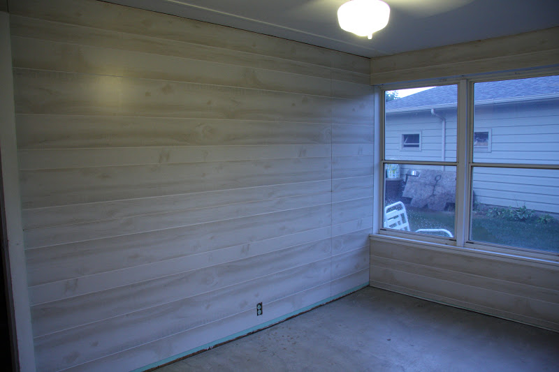
When it came to a redo, I wanted to do a nice job, but not spend a ton of money.  My original intent was to have horizontal white painted paneling for a cottage look, but when I came across these wood-look panels at Lowes (for only $12 a sheet, nonetheless), I reconsidered--here they are leaning against the wall and ready to go.


The color is sort of a pink/gray/beige, but the look is like a whitewashed driftwood, which I am in love with right now.  These panels are nothing special--the walls in our grandparent's basements are lined with them--but it was the color that caught my eye, and I new that hanging them horizontally would update them and give me the look I was after.

Here's a look at the room after we took out all of the carpet and hung the panels:


And here's where I painted the floors not once, but twice.  Typical move by me, to be unsatisfied with my first paint choice.  You'll see in this photo how green and nauseating the first color looked (in the center), next to the much more desired gray/brown tone (on the edges).  The guy at Sherwin Williams worked magic to "correct" my partly used gallon so I wouldn't have to pay for a whole new batch.  The color that I ended up with is close to SW Amazing Gray.


Here is where the room is at today.  I love how it feels in there now--so serene and calm. I only have a few accents here and there, but my plan is to keep it neutral, anchored with some black and white and splashes of fresh green.


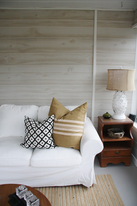
The lamp was a quick little project that I posted about here.  I love how it works within the room!


I've gone back and forth about hanging something above the sofa.  I think what I'd like is to have a sculptural piece that doesn't detract from the "driftwood" walls.  For now though, I'm kind of liking it blank.


So in the next couple of weeks, I'll likely be packing up the pillows and accents, covering the furniture, and saying goodbye to this room until springtime.  Its been lovely having it this season, and hopefully by next summer, I'll have all of the finishing touches complete!

10.01.2012

Homesense Happy

I posted here about a little find from Homesense--all you lucky Canadians out there know of the store I'm talking about.  Here it sits, in its $29.99 glory:


And here it is, available for purchase for $110.00 from Jonathan Adler.  Still flying high about this little acquisition:


I would have been happy forever with my one little piece of Jonathon Adler pottery, so imagine my delight when I opened this up on my birthday last month:


Yep, I got another one!  After my initial score of that gold bowl during my last visit to Canada, my sister in law was on the look out for similar pieces, and actually scored the same one for herself.  Then one night, she called me from Homesense, excited as could be to tell me that she'd found another piece--this one on clearance for $25.00!  I told her to snag it for me right away, and was even more excited to open it up as a gift-wrapped little treasure for my birthday.  Here it is from J.A.:


I don't know how any of this stuff works, or how places like Homesense can get these types of pieces (that are still available at full price elsewhere) and sell them for so cheap, but I'll take it.  Maybe my two little vases have some miniscule imperfection, but they look perfect to me.  Here are a couple more peeks at the shelf flanking my fireplace:


I love owls, and have several (too many) around the house.  The ones I collect are mostly white, but these little treasures are particularly special.  They were on a coffee table at my grandma's house as far back as I remember, and when she moved into a smaller apartment, many of her things needed new homes.  I was happy to take this little family of owls, and they now proudly stand as our little mascots--one for each of us in the house :)

I do promise an overall shot of my fireplace wall, including a look at my new shelves.  Surprisingly, they are completely decorated and styled, and my little guy stays away from them for the most part.  Could be the wall of toys I have as decoys, and as soon as I can move all of his gear long enough to snap a few photos, I'll get them posted.

Happy October!

8.17.2012

Bananastrudel & My Bathroom

I came across the Etsy shop Bananastrudel when I was working on Tate's Nursery.  It is filled with vintage maps, prints, lithographs--you name it.  There is a ton of subject matter to choose from, and the shop owners have done a wonderful job curating many beautiful frameable items.  I like to visit often because there are always new things popping up.  A while back, I found two beautiful botanicals and purchased them right away, knowing I had the perfect spot for them:


They arrived in the mail beautifully and carefully packaged--it was such a treat to open and find goodies and even a handwritten thank you note inside.  These guys know customer service!


I've had these framed prints for years and years.  I worked in a custom framing shop during college (LOVED that job), and ended up with some nice artwork after my time working there.  As for these prints, I liked them at the time because they are sort of architectural, but now I think its kind of dorky that I chose them.  I believe that art should be personal and reflect something about us, and I've never been to France or England, so why do I have these hanging on my wall.  Good question.


I love the frames with their subtle gold detailing, and although they were custom, they were the exact right size for my Bananastrudel botanicals.


The mats wouldn't work, but I wanted to do something different anyways, so I just mounted the prints on off-white foamcore using some 1/8" thick adhesive foam strips to "lift" them off of the foamcore a bit.  Here they are, nicely filling some blank wall space in my newly renovated bathroom (photos of that coming.....hopefully soon):


The prints themselves are of wild buckwheat and wild oats.  They remind me of home--Saskatchewan, Canada, where grain farming is abundant.


A tiny sneak peek of part of the bathroom.  The ledge is Cararra marble, and is wonderful as extra "counter space".  The toilet is an Aquia Dual Flush by Toto.  Best looking, functioning, and easiest to clean toilet ever, and I recommend it all time.  Check out some before shots of this bathroom here, and as I said, a complete reveal is coming soon.


Accessorizing in the bathroom is fun, but things get covered in that dust/towel lint so quickly!  This is our primary bathroom right now, and its hard to keep all of the hard surfaces and collectibles dust-free.  Especially if you're me, and you haven't figured out why your house seems so dirty all the time and everyone else's seems so clean.  Something I wonder about all the time :)


The blue bottles are antique apothecaries that my parents-in-law dug up in a friend's backyard years ago.  Quite the find, and I love how they look displayed in a collection.  The brown bottles are part of a much larger collection that I amassed while working for many years with my pharmacist dad in his dispensary.  I like the history that these things suggest--medicine typically doesn't come in glass bottles anymore.


And for a modern touch, this little clock from West Elm is the perfect size and shape.  Took me a while to find something that would work here, and for $12, I'm more than excited about this one!

Have a great weekend!

7.31.2012

Nearly Complete.....Entryway on the Home Stretch

Last week marked the final phase (of sorts) in our entryway.  When I say that, I mean that all of the work that needs to be done by contractors is complete.  It doesn't include me putzing and painting and decorating and changing my mind until its just "so".  The finished finished product will eventually arrive, but until then, here's a little peek at last week's progress.  Where we started:


Where it sat for a couple of years:


And where it is today:


Such an improvement, even with the cobbled together finishes that have yet to be painted!  When I originally asked my contractor to bid the project, I asked him if he had time for a "quick little job--maybe a half day or so".  Clearly I had no concept of what it would take, as he told me that it would likely be a two day job.  He ended up being there for just over two days, and I learned a thing or two about how much goes into calculating and measuring to get things to work out right.  And we had a skilled carpenter working only on a small staircase project.  I have a new respect for what goes into making those dramatic and beautiful staircases look perfectly planned and put together, and I'm grateful for the care and attention that went into getting this project done for me.  Although its certainly not big or bold, this space is approaching the finish line (finally), and I'm proud of how its looking because I've waited so long to get here.  A beautiful staircase and entryway can really set the tone for what's to come in the rest of the home as well as anchor the space it sits in.  Here are some great inspirations:


Black is a beautiful punctuation mark in both of these stairways.  I like how its used with restraint in the top image, serving to guide the eye up and around and accentuating the architecture of the staircase.  In the second photo, the richness of the handrail and stair treads is repeated in the picture gallery and lantern pendant, making the space look wonderfully cohesive.


I love how the staircases in these images serve as a backdrop for the other elements in the space.  The railing and spindles become part of the entire composition and offer a jumping point from which to choose other textures, colors and finishes.  That last photo with the spindles running full height is spectacular, and I can't take my eyes off of the perfect balance, proportion and symmetry that it creates!


Whatever the material or color, a mass of spindles can create great visual repetition.  In the first image, an all white palate by my design crush Sarah Richardson strongly reinforces the graphic nature of the staircase.


Great modern take on traditional spindles without looking the least bit contrived.  Or, if modern is the way to go, how about no spindles at all?  LOVE the simple but bold statement this space makes:


I think wood spindles would have been too much in this cozy little space.  The delicate metal x-mullions are perfect in scale and design, and bring the art collection into the rest of the space.  My favorite part is the gold finial--a great finishing touch!


I want to live here!  The rope staircase suggests a casual and relaxed lifestyle, perfect for a day at the beach, which I'm sure is right out the front door of this charming little space.  


Finally, even though the staircase isn't in full view here, I love the angle of this shot and the feel that it gives. Reminds me of the summertime where playing outside all day long is calling, and little grass-covered feet run in and out for home-made popsicles and lemonade.  A simple beautiful space that's ready to take on the joys and messes of family life.....:)

7.25.2012

Entryway Updates & How to Survive a Never Ending Renovation

If you're anything like me, the lure of a "project house" can sometimes outweigh logic and practical sensibility.   In the fall of 2009 when we purchased our current home built in the 1950's, we (and when I say "we" I mean "I") had a romanticized view of what it would be like to transform the space and call it our own.  I have the advantage of being in the design and remodeling industry, but even with an understanding of the work and upheaval that goes into every little thing, there have been (and continue to be) times when I wonder if it will ever get done, and I'm just tired of living in a constant mess.  Since we moved in, we've completed most of the first level, including the kitchen, bathroom (after pictures soon!), Tate's nursery, as well as the majority of the entryway.  What's left is our bedroom and the sunroom, which is currently in progress.  Looking back, its been quite a journey, so here are some progress pictures as well as some thoughts and survival tips!


This is the best picture I have of our entry stairwell when we first moved in.  It leads to two large bedrooms on the second level (one is our future master bedroom......someday!), and was completely enclosed, with a door at the bottom.  It seemed awkward and claustrophobic to me from the start, and we planned to open it up at the same time as we did the kitchen renovation.  Which we did here:


1  L O O K I N G   F O R W A R D   I N S T E A D   O F   B A C K W A R D
The demolition in this phase instantly opened up the space, and made me excited for a future project, which involves renovating the second level.  Plus, an open staircase is well-appointed in this entryway, and offers the opportunity for a nice stair runner, fun painted stairs, etc.  Several times over the past couple of years I've had to remind myself that its important to look forward and not backward.  Its so easy to get wrapped up in the fact that a finished product takes time, and sometimes its a even nightmare to get there.  In my personal and professional experience, those who can respect the process, understand that we're all in it to achieve a beautiful end goal, and plan for that end goal instead of fixating on present and past headaches are happier throughout the process and more satisfied in the end.

2  T R U S T   Y O U R   C O N T R A C T O R
When it comes to your home the importance of finding someone you love working with is huge.  From the beginning, we've worked with great contractors who are trust-worthy and detail-oriented, and its made it easier to get through the bumpy times.  I am always budget conscious, and want value for my renovation dollars, but you can't always put a price tag on peace of mind. Knowing that the person you hire has your satisfaction as top priority will help you not to sweat the small stuff.  The guy I love to work with has such a positive and "can-do" attitude and takes a lot of pride in the work that he does.  He's a good communicator, I trust his judgement immensely, and would be happy to recommend him to anyone in the Minneapolis area looking for good work at a fair price.


3  D O N ' T   N A G   Y O U R   H U S B A N D
At least not all the time :)  My husband has been so great at tackling a large portion of the demolition, and keeping me on task when necessary (I tend to get sidetracked).  He's trusted me with almost all of the design decisions, and although I know I can be a nag sometimes, I find that he responds better when asked nicely.  Don't we all?  It also helps when I'm willing to get in there and get my hands dirty, as the above (goofy) photo shows.  I promise I dress nice for my job, but when it comes to home stuff, the baggier and comfier the better!


4   S M A L L   P R O J E C T S   C A N   K E E P   Y O U   S A N E
Here's a peek at my new grasscloth walls!  After waiting for back-ordered material that turned out to be defective once installed, taking that off of the walls and ordering different product, the project is now complete.  It seriously took almost a year for this whole process, and as you can see from the horrific wallpaper that is underneath this beautiful grasscloth, it was hard to live in the mess for as long as we did.  It was worth waiting for though, and it helped to do a couple of little "crafty" projects in preparation for the new wall space.  I framed these old keys using a natural linen background, and the antique pieces are a nice contrast to the modern magnetic key holder from Umbra, which is a sleek way to store keys as well as incoming and outgoing mail.


5   B E   G R A T E F U L   Y O U   H A V E   A   H O M E
Here are a couple of photos of where we're at today.  It was worth the wait, and the pretty grasscloth walls make me happy every time I walk in the door.  You'll also notice that we added new interior doors--5 panel as opposed to the flat wood ones that were previously there.  The look is serene and clean, and the texture adds a nice warmth.  Even though its taken a while to get here, looking back on the process reminds me how grateful I am to have a home.  I mean this in the most sincere way, and have to remind myself of this on a daily basis.  We are bombarded each day with new design inspirations, creative spaces, diy projects and beautiful before and after images, and its easy to get wrapped up in "what could be".  I think that if we're not careful (me at least), there's the tendency to become dissatisfied with what we do have, and the blessing it truly is.  With the housing market as its been for the past few years, I'm grateful for the four walls I have around me, no matter how imperfect and incomplete they may be.

Check back in a few days.....we're getting the handrail and spindles done this week, and I couldn't be more excited that this area will finally be done!

7.19.2012

Living Room Updates: Sneak Peek

This past weekend was a productive one.  Thanks to my parents-in-law, who are very generous with their time, my husband and I were able to make a dent in a few projects while they kept an eye on the little guy.  One thing that's been on my to-do list for over a month is getting grasscloth wallpaper on the backs of two new shelves for either side of my fireplace.  I purchased these units from IKEA at the beginning of June, and they've been randomly sitting at the end of the living room since then:


I'm actually pretty pleased with how these look.  They are solid wood construction (surprising for IKEA), the ends are paneled, and they sit nicely on simple square legs.  The finish is kind of a white "wash", which I wasn't sure about at first, but it reads as a solid color in my space, so I'm happy.  Plus, they were on sale (also surprising for IKEA), so I feel like I got a deal.  In a perfect world, I would have an entirely custom built in fireplace surround like what I design for my clients, but that's not always "in the budget" :)  More on that in a future post!

After our grasscloth disaster got resolved I had a few feet of leftover material--just enough to cover the backs of my new shelving units.  The result is exactly what I was looking for, and gives them a more custom, 'expensive' look.  Here's a little peek:


It was easy to style these shelves, since I've had all of these treasured little items stored away just waiting to get out and on display.  I like to take the jackets off of all my hardcover books anyways, but feel like they look even more uniform and pretty when turned around so the pages show.  My plan is to have both shelving units accented with hits of turquoise and chartreuse--the colors really pop against the gray-toned grasscloth back, and tie in with the rest of my living room.


This die-cast, Franklin Mint car is a recent acquisition, and a most treasured possession.  My dad has collected these for years, and has a beautiful collection of classic cars that spans many decades.  This 1958 Chevrolet is one of his favorites, but he parted with it so I could have a little "piece of home" in my living room.  I chose it, of course, for its shape and color, and love how it looks.  Thanks dad, for sharing your toys!


After we got married, my husband would say to me almost daily "I love my life with you".  I loved hearing those words, and was so excited when I came across this graphic card that said the same thing!  I framed it in a simple IKEA frame, but wrapped the mat with natural linen to make the words stand out even more.  Its been sitting like this under my bed for almost a year--I'm glad I finally have a place to display it!


Let me tell you about this little piece.  For all of you Canadians out there, lucky you.  You likely have a Winners/HomeSense right out your back door.  Being in the USA now, I miss this store terribly because others like it--TJMaxx/HomeGoods just aren't cutting it for me.  The two retail chains are similar in concept, but I would say that the US version (HomeGoods) is like HomeSense but without all the stuff :)  Take this amazing find, which I spotted for $29.99.  Initially I thought it was a bit pricey, since small little objects like this are usually under $20.00.  Upon closer inspection though, I realized that it was a Jonathan Adler piece, normally selling for $110.00!  You bet I snapped it up.  I usually walk out of HomeSense with a handful of treasures, and this trip was no different.  More on that in a future post.


I have stacks of Canadian House & Home Magazine--I think I've had a subscription for over ten years now. I can't seem to part with any of the issues, largely because the content is so good, but also because the spines are so pretty and I've always wanted to display them like this.  I grouped like colors in a few colorways, and plan to fill the top row if each shelving unit with them.  Cheap, easy, and a great way to store and display my over-abundance of design magazines!

That's as far as I've gotten so far, but I'm having fun styling and playing around with this little decorating project.  Again, I'm so pleased with the way the grasscloth elevates the style of these units, and recommend it if you're looking for an inexpensive and easy way to add some style!