Related Posts Plugin for WordPress, Blogger...

8.01.2011

A 50's Bathroom Update

Even the smallest of updates would be an improvement in this existing bathroom.  Heck, we would have settled for running water in the sink.  For more than a year we'd been living with a cold water trickle only, and using the bathtub for all daily washing--sad, I know.  Since we moved in and the problems began, we debated replacing just the faucet (which turned out to be a plumbing nightmare), to replacing the entire vanity top or vanity in order to "make due" for the next few years.  Eventually (and as you'll see in the photos), we realized that one small "fix" would have led to another area needing attention, and the project snowballed into something that we were either going to have to do all at once, or live with it the way it was.  I chose to do it all at once--and at 7 months pregnant, why not take on a major remodeling project? :)


This bathroom was really more like a tiled bunker--so heavily clad in mortar and flesh colored 50's tile that it could have been our panic room in case of emergency.  From the walls to the floors to the fixtures, everything was done in varying shades of pinky-peach, and wallpaper had been added sometime in the last 60 years to "tie it all together".  It was truly like stepping back in time every morning we woke up and walked into that space!


One of the (many) problems with this space is its long, narrow orientation.  Sure, we could have knocked out walls and borrowed space from other rooms, rearranged fixtures and really gone all out, but keep in mind that this is kind of a "forced" renovation, so my challenge was to keep it simple, keep the existing footprint, keep it on a tight budget (most importantly), and still make this a more functional space for our growing family.

Great progress is happening, and I'll post more pictures this week, but for now, here's a sneak peak at some of the fixtures and hard finishes that will be going into the space:


The overall look is cool and clean, but with some fun and interesting materials and textures.  The glass and marble accent shower tile went in beautifully, and I'm excited to see how the floor tile goes in this week.  I chose a dark, wenge-colored porcelain tile that comes in long narrow pieces and evokes the look of hardwood floors.  Super durable, but with a bit of interest, and I think the dark color will really anchor the space.  I'm also adding touches of weathered oak in the form of storage cabinetry, so that will add another texture and tone to this cool scheme.  Check back for progress, and to see how its all coming together!  

7.27.2011

Let's Try This Again

I've done a shameful job of maintaining this blog for the past few months.  Shameful.  While I fully realize that keeping readers engaged and building a base of followers requires commitment and consistency, I've let several things get in the way of moving forward in this endeavor.  Call it being busy with work (not a good excuse--everyone is busy), or allowing myself to feel like I had nothing great to write about, whatever way you look at it, I've missed great opportunities to share over the past months because I simply haven't set aside the time.  That said, I do feel like one special thing has been "distracting" me since early this year.  A few months ago, this happened:


Yes indeed, we're expecting our first baby--a little boy--arriving in mid-October!!!!!!  The pregnancy has been great, and I feel like there is so much to look forward to.  The anticipation is killing me these days!  So being that there are big changes coming our way in just a few short months, and knowing that our little CottageModern needs to be ready for a new family member, things have been very busy around here. Currently, we're living through another round of demolition/renovation, this time its the bathroom and nursery that are under attack.  Great transformations are happening, and I'd love to start sharing some of my projects again.

So if you're still out there, and haven't completely given up on hearing from me, I appreciate it so much.  I promise to make it interesting, and make up for lost time with some great project updates!

4.18.2011

Living Room Mood Board

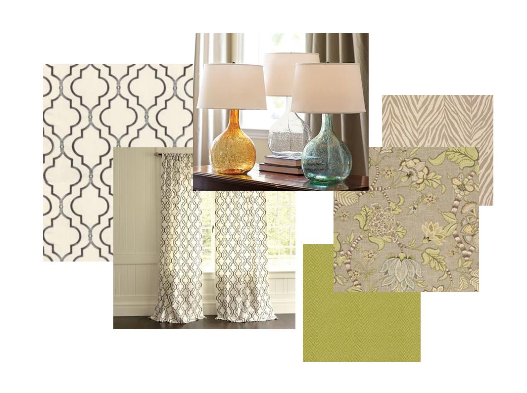
I recently had the privilege of working with a wonderful new client who asked me for help in "casting a vision" for her new living room.  Her and her husband had purchased a home, and after living in it for almost a year, it still isn't feeling like "home" to my client.  She wants to start working, room by room, and have an overall "plan" and vision to work toward.  Great idea, and I got to work creating a floor plan, and a couple of mood boards for her living room and adjoining dining room.


Although the overall scheme looks somewhat "white" in this photo, trust me, for this young family, we're upholstering those pieces in rich, kid-friendly fabrics and colors.  I'm seeing that sofa in a fresh olive green color, with one of the accent chairs in a chocolate microfiber, and the other in a chunky natural linen.  The walls will be painted Sherwin Williams "Amazing Gray", which will provide a lovely backdrop and bring in some of the gray tones in the zebra rug, and floral accent fabric.  For another hit of color, I'm seeing the backs of those shelves painted Benjamin Moore's "Stratton Blue".


My client wanted a scheme that had some personality, but was neutral enough to bring in different color tones throughout the seasons of the year.  I think a warm gray is the ideal backdrop, with the green bringing in a pop of color, but acting as a neutral with the ability to blend with blues, turquoises, ambers, violets, etc., depending on the time of year.


We also chose this gorgeous metallic damask for the adjoining dining room.  It will pair with white paneled wainscotting on the lower half of the walls, and add a hit of glamor and shine.

I'm excited to see this come together, and shop for the "finishing touches" once the room is furnished.  Its hard to show one-of-a-kind finds on these boards, but I think that's definitely what this room needs to pull it all together--a little bit of vintage, and a little bit of modern.  I'll be on the hunt!

4.12.2011

It Must Be Special

Wow, two posts in one day.....I don't think this has ever happened for me!  There must be something special about this day that warrants a mention.  And there is.  Three years ago today, after months of immigration paperwork, years of long-distance, and a lifetime of anticipation, I married my best friend and started our journey together as husband and wife.  We've had a wonderful three years of marriage, and what was the sweetest wedding day ever, has gotten even sweeter with time.  I loved him to pieces on that day, and I love him even more today.  Cheers to three years, and a lifetime of anniversaries to look forward to.......

How To Decorate Around a Huge T.V.

We were recently gifted with a beautiful antique buffet by my parents-in-law.  The piece is quite traditional, and I wasn't sure how it would integrate with my more modern decor, but I wanted to give it a try.  I asked my husband to bring the piece over one weekend while I was out of town, and to my delight, when I arrived back, it was sitting in its place in our living room, with little floor protector pads under each leg.  What I didn't notice, however (not right away, anyways), was the GIANT new television that was sitting on top of the piece, perched prominently in our living room.  Obviously, Mr.CottageModern figured that if I got something new for the living room, he should too.  So began the quest to try and "disguise" this black beast, and make that side of the room look nice despite it.  Avoiding the issue, this is what that area has looked like for the past while:


This space had really become a junk collector with a big blank wall behind it.  All of the component cords showing underneath drove me nuts, but that was secondary to the huge television that dominated the arrangement.  Last week, I was a guest presenter to a lovely group of women on the topic of "Designing on a Budget".  One of my budget design principles is to 'shop your own home' to refresh and revive your space, so I decided to take my own advice and do that here.


While the television hasn't magically shrunk in size, now there are some pretty things to "distract" the eye.  I moved the art piece to a new wall, and added a mirror (it had been lying on my floor, in a box for months) to reflect light in its place.  A chair was moved from another area in the room, and pillows were added for an injection of color.


I moved a lamp from another area and placed it on the opposite end of the television.  Together with the art as a backdrop, it adds some weight and height and helps balance the scale of the T.V.  A stack of books, frames, and other collectibles, including a vase from my Ernest Miller pottery collection (my favorite things) help to personalize the arrangement, while trying to take some attention away from the other video components.


Finally, I cleaned up all of the hanging cords, and added some larger pillows and a ceramic stool under the buffet for extra "seating" when guests are over.  I would say that while not "perfect", this area is definitely improved from what it was, and the television is somewhat less of a distraction.  The best part--it all cost $0.00--budget design at its finest!