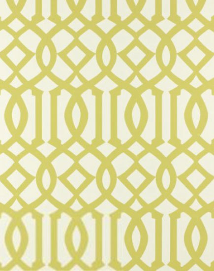
If money were no object........
Imperial Trellis in Citrine would be my number one choice. Everyone loves this pattern--in fabric and wallpaper--and I'm no exception. Maybe its the graphic pop, or the combination of curvy and straight lines, or maybe its the striking repetition of pattern--whatever it is, this design is so interesting, and I love the acid green-against-white colorway.
I also came across this trellis pattern, which would be a great second choice to the Imperial Trellis:
Unfortunately, the paper itself is "thinner" than I think it should be for the condition of our walls. We've patched them as necessary, but I feel I need something with more thickness to hide the imperfections I'm not seeing. See more patterns and colorways from this collection here.
In my search, I came across this and was drawn to it because of the light silver-gray color and overscaled pattern:
I took a quick photo when I was at the store, and neglected to write down the brand. Needless to say, while I love the pattern and subtlety of the color, it has a metallic sheen to it that I think I'd get tired of too soon.
So after looking through countless wallpaper books, and really adoring so many of the graphic, colorful and interesting patterns out there, I feel like I just can't commit to anything too trendy for my entry and stairwell area. If I was considering changing it out again in a few years, I'd definitely take the plunge and do something more fun, but since that's not the plan (WAY too many other house projects chewing into the budget), I'm back where I started......still wanting my grass cloth.
This photo shows the two new samples I found that are closest to what I have on some of the walls (my current grass cloth is the background). The weave of the new ones is a bit more course, but I don't mind the added texture. I think the top one is the one that will work best as it leans more toward a green-gray than a purple-gray like the bottom one.
Grass cloth adds so much glorious texture to this room, designed by Frank Roop, and plays well with the other textures going on in the space.
So with all of the many books and patterns I've looked at (and there have been a ton), I'm sorry to say that I'm not more of a risk-taker with pattern and color. However, I need to go with what I know I'll love in the long run, and my plan is to get the stuff on order this week!


4 comments:
Good for you for following your gut. I must admit, I did get really excited when I saw the Imperial Trellis but I do think the grasscloth will be a classic look that you won't tire of - and it will add so much warmth and texture. Keep us posted!
Wall coverings are such a commitment. I recently found and fell for a bold color/patterned paper that I am contemplating for my dining room. But I fear that I will grow tired of it sooner than later. Grass cloth was my first idea for this space, after reading your post, perhaps I will go back. Thanks for sharing, liz
I love grasscloth! And with the expense of wallpaper it's better to stay with something classic and to add to it with art and accessories that are easy to change out.
Great collection of wallpapers. See more great Children room wallpaper.
Post a Comment