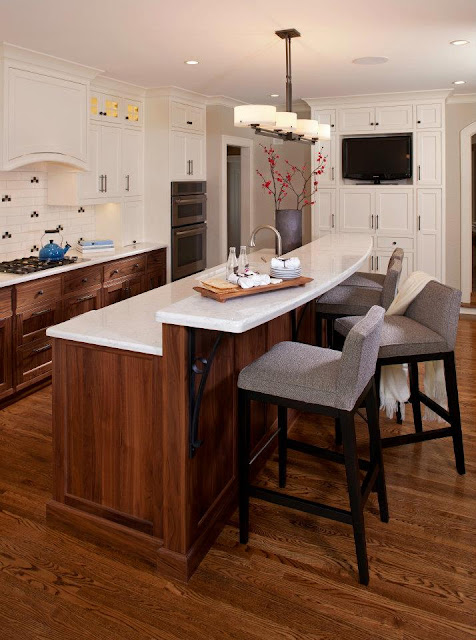
And transform it into this:
From the beginning, I enjoyed working with Rena. Her talent and good design sense were immediately evident as she completely re-imagined the space and created a truly functional and gorgeous kitchen for a busy family of four. It is really the focal point of the entire home--a 1930's two-story with some unique original features.
While there are many well-designed new features in the space, two elements strike me as particularly successful in making it really stand out. The first is the use of symmetry and horizontal line throughout the room. A range wall is a great opportunity to create a focal point and it makes a bold statement here, flanked by well-proportioned upper cabinets and anchored by the fridge and wall ovens on either end. Additionally, there is a strong horizontal line around the top of the room--seen as the small-scale glass cabinet doors transition into horizontal flip up doors above the fridge and ovens, and then as they are followed through on the television cabinet. This element looks planned (because it was--very carefully!), and small details like this make the design look intentional.
The second element that I love in this kitchen is the mix of materials. This stands out to me as a beautiful feature because of how well executed it is, using just the right amount of wood tones with the white cabinetry. I've seen this done poorly in so many kitchens, because often people choose a mish-mash of woods and finishes because they think it will enhance the design. In this case, however, the ratios work wonderfully, with the walnut playing to the tones in the floor, and the painted finish adding just the right amount of contrast to make the whole thing pop. This feature alone is proof that hiring a designer can ensure that you'll get everything you love into your space--in the correct and most pleasing proportion.
Overall, I'm so proud to say that I played a part in helping to make this gorgeous design become a reality. As I mentioned, it was such a privilege to work with Rena on the project, and it was her hard work and attention to detail that pulled this together for her clients. I'm hopeful that they will enjoy a quality and well-designed kitchen for years to come.
To see more of Inview Interior Design's beautiful rooms, click here (you won't be disappointed!).


2 comments:
What a collaboration! It's beautiful!! Along the lines of your comments on the horizontal lines at the top of the kitchen - I think that is also played out so well with the light fixture over the island too. I can't even believe it's the same kitchen. This family will enjoy this timeless look for many years. Off to check out Rena's website!
Wow, its gorgeous, congratulations on a a stunning kitchen!
Post a Comment