This kitchen shows classic inset cabinetry, a subway tiled backsplash, traditional moulding details, and restoration-style pendant lighting. Personally, I love this look because it shows off a strong attention to detail, and a warm mix of materials that will have nice patina over time. Same with this one:
The dark stained furniture-style island, as well as the arched valances on the toekick moulding nod toward a traditional point of view, as does the lovely crown detailing. Trad styling can even be seen in the small details like the exposed hinges on the cabinet doors.
While I love the history and craftsmanship that a traditional space represents, and even though it seems like everyone is after a white kitchen these days, not all folks are into the classic detailing that is seen in so many of these spaces.
So what about a "modern-transitional" style? I'm seeing a lot of this lately, and would describe it as one that has contemporary elements, but is neither completely modern, completely transitional, and certainly not traditional. In this week's Kitchen of the Week, I thought it would be fun to discuss this style by featuring a current project done by one of my extraordinarily talented co-workers, Carol Sadowsky. She's a designer with 30+ years experience, and I'm honored to work with her and learn from her on a daily basis.
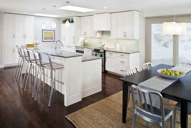
This newly renovated space is fresh, airy and full of light. Contemporary detailing is a nod to a more modern aesthetic, but a balance of elements keeps it from looking too modern and spare for the young family who lives here.
MODERN-TRANSITIONAL ELEMENT #1 - Shadowline at ceiling instead of crown moulding.
This detail could be easily overlooked, but if you imagine a traditional crown or cove moulding at the top of the upper and tall cabinets, the look would have been totally unbalanced and out of place. Eliminating an upper moulding completely keeps a quiet, clean line.
MODERN-TRANSITIONAL ELEMENT #2 - Shaker style doors with extra-wide styles and rails
MODERN-TRANSITIONAL ELEMENT #3 - No mouldings, anywhere.
This relates to the elimination of the crown moulding, but also notice that at the island, where you'd typically see a 4" high applied base moulding, the cabinets are scribed right to the floor with a nice wide rail at the bottom. There is no additional detailing at the wall cabinets either, where you might typically see a "light valance" moulding applied under each wall cabinet.
MODERN-TRANSITIONAL ELEMENT #4 - Fully integrated appliances.
On the far left hand side of this photo you'll notice a fully integrated fridge. This type of application is an investment, but definitely worth it as it is the only way to get a completely flush look, keep everything on the same plane and make the fridge disappear. Its hard to see in the photo, but to the immediate right of the fridge is a fully integrated microwave drawer. Also a key piece that "disappears" as it sits on the same plane as the cabinet doors.
MODERN-TRANSITIONAL ELEMENT #5 - Back painted glass backsplash
This is one of my favorite elements in the space, and one that I think is truly modern and sleek. The soft aqua color adds some subtle contrast, but besides that, this is a quiet element that brings in a highly contemporary feel. Add to that its SO easy to clean, and I think its the perfect choice.
Overall, the result of this kitchen is a perfectly executed mix of elements--an excellent example of modern-transitional style. In looking at the simplicity of the space, you'd think it takes less planning, designing and attention to detail than a highly decorated and ornate traditional space. In fact, the opposite is true. These spaces are often the most difficult to plan and execute because the sleek and simplified nature of the design allows almost no margin for error. It takes a skilled eye and trained design aesthetic to understand the building blocks of putting a contemporary space together, which is exactly what Carol has.
One more little sneak peek of her work......the space planning of this renovation was so well done that she was able to design in a separate office for both homeowners to work in--adjacent to the new kitchen. Genius, and the perfect little "bonus":
Isn't this a great little space? Small, yet functional and so sleek. The best part--there's a door at the other end of this room, so the office mess can be hidden away at a moments notice. I wish!
Have a great weekend!


.jpg)


2 comments:
This kitchen is gorgeous! I'm furiously taking notes on your notes because we're in the middle of a kitchen remodel and trying to make decisions about these little, but seriously important, details!
Kristen, you are the best with these posts. You explain everything so well and give clear examples. After reading this post, I do believe that I lean more toward a modern transitional style when it comes to a kitchen. And Carol did a fantastic job with this kitchen - it's beautiful - I love the backsplash, the cabinets, the detail on the island. I love the built-in seating area that you can see in the one photo - that looks great.
Post a Comment