Related Posts Plugin for WordPress, Blogger...

12.13.2012

TOUCHES OF CHRISTMAS

I mentioned in my last post that decorating at my house had been on hold because of my involvement in decorating for church events this year.  I'm happy to say that after being snowed in all weekend, (Minneapolis got hit hard, and I LOVE all the snow we have) my house is much more Christmas-ey now.  I'll  post some photos of that this weekend, but first I wanted to share some more fun stuff from my weekend of decorating for my church.

Every year, a fantastic committee plans a 2 two-night event for women only--a fancy dinner with a Christmas program to follow.  It takes a ton of planning, coordinating and preparation to pull it together, and it always ends up being such a fun event.  One of the most unique parts is that handfuls of women sign up to "hostess" tables for the dinner, and part of their duties is to set and decorate their table.  This means that out of 20 or so tables, each one is different and special, and there are lots of ladies that pull out all the stops!  I only have photos of my own to share (which I decorated with my mother-in-law), and I'll tell you that ours was far from the fanciest one there!


We did it in cream, silver and gold--very monochromatic but nice and sparkly.  I used my dishes, and basically just scoured my house for other accessories.  I have a small collection of mercury glass vessels and objects, hence the centerpiece.


My mother in law found these inexpensive silver doilies for on top of the plates--I like how they add a nice lacy touch, and don't scream "doily".


The starburst mirror lying flat on the table didn't start out white and pretty.  That's for another post--it is a good before and after :)

The best part about this large room is that when all the tables are decorated, they turn the fluorescent lights out and we eat by candlelight, along with some ambient light from large chandeliers hung from the ceiling for this event.  It is so pretty, and a great way to kick of the season.  Even though it was a lot of work, I enjoyed every minute....looking forward to next year!

12.07.2012

WHERE I'VE BEEN

Yikes.  Life has been full lately--maybe fuller than I'd like.  I've been blessed recently with some great new clients and new design jobs, and with Thanksgiving and Christmas preparations thrown into the mix, it feels like I've been unable to catch my breath!  I've noticed around the neighborhood that almost everyone has their trees up, house decorated, and I'm sure smelling like cider and salted caramels.  With the exception of our outdoor lights hung (thank you, husband), our house remains completely void of Christmas decor, and smells like diapers and last night's leftovers (sorry for that image) :)  I intend to have a decorating blitz this weekend, but I do have a good excuse for being this far behind.

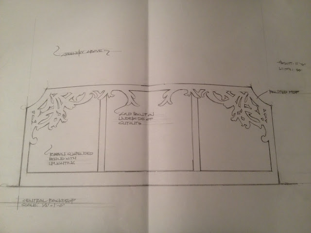
In recent years, I've had the privilege of providing leadership on a couple of decorating committees at our church.  I work with some really talented and innovative individuals, who have been awesome at taking some of my design ideas and transforming them into beautiful sets.  A couple of years ago, I sketched up a backdrop that turned into a glorious winter wonderland:


The backdrop was about 12' tall by 30' wide--it needed to be to have impact in this large of a space.  Here it is complete with Christmas trees, decorations and LED lights:


A huge undertaking, with a lot of talented and innovative people to pull it all together.  It was so much fun for me to design in this type of atmosphere--certainly not what I have the opportunity to do everyday!

So fast-forward to this year, and we decided to go with a more simplistic, nature-inspired scheme.  It did take a while to pull together, but not quite the magnitude of what was done previously.  I really like the result though--


The main backdrop was created with "boxes" that we built, painted and attached birch to make them look like long planters with tall trees.


The length of the "planter" totalled 24', and we added simple natural garland to continue the theme.  The billowing fabric on the back wall is actually long tablecloths with a metallic thread running through them, which I sewed together so we could have 20' long panels.  Here's a look at the work in progress--almost finished:


The effect is really pretty, especially when its lit with different colors of LED's which cast beautiful light up the fabric panels and birch logs.  Overall, this is a pretty simple concept with really basic materials, but it creates enough drama and the feel of Christmas to make an impact in this large space.

So that's what I've been up to, and it didn't stop there for me last weekend.....I'll post about that next week :)  Time for me to get my act together and decorate my own house now!

11.15.2012

PUMPKIN DELICIOUSNESS!


Made these yummy treats for the lovely ladies in my Wednesday night MOPS group.  Happy to say that I came home with two completely empty trays--they were a hit!  Here's the recipe (from the Barefoot Contessa) just in time for the holidays.  It would make a great and easy addition to any Thanksgiving dessert menu.


Enjoy!  These are delish, and the temptation to sample the frosting (over and over!) is hard to resist.  You've been warned :)

11.11.2012

[GOOD] DESIGN IS IN THE DETAILS

Its been a while since I've posted a thought/opinion piece on kitchen and bath design.  There are a ton of things that make a kitchen or bath space look like a designer had some input, and similarly there are details that are easy to miss without the help of an expert.  Obviously I couldn't possibly cover everything, but here's a look at a few small details that can really set your space apart--things that are easy to miss if you don't know what to ask for.

CORNER DETAILS & STONE COUNTERTOPS
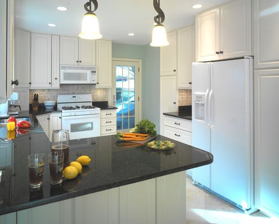
When it comes to countertops, there are a ton of options for thickness, edge profiles, etc.  If you're doing stone, the most budget-friendly thickness is a 3cm (approx 1 1/4"), and while you generally know to select an edge profile (eased, ogee, bullnose, etc.), its the corners that I find often get overlooked.  I found out a few years ago from a fabricator I was working with that if the client/designer/homeowner didn't specifically ask for a certain corner profile, they automatically defaulted to a radius like this one (on the corners of the island):


Or even more rounded, like this one:


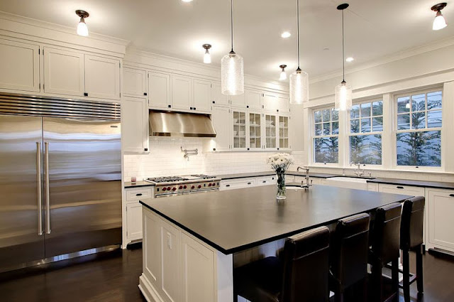
I would be sick if I ended up with something this pronounced without knowing about it, and I should clarify by saying that most stone fabricators don't take the risk and do want you to specify what type of corner roundness you want.  When in doubt though, I always ask, and my preference is to go with nice crisp corners like these:


These corners match the pencil/eased edge on the countertops themselves, and keep the look sharp, clean and simple.  A small detail that goes a long way.

FRAMELESS CABINETS WITH APPLIED END PANELS
When it comes to cabinetry, the sky is the limit when it comes to detailing and design.  There are different types of cabinet construction--face frame, frameless, inset--and particular sets of details that apply to each one.  Frameless cabinetry offers a clean look, and can lend itself to many different aesthetics, from contemporary to transitional.  An often-overlooked detail to keep in mind with frameless cabinetry is how the ends of each cabinet run will be finished off.  While an exposed cabinet end will always be finished, adding an end panel incorporates an elevated level of detail. An excellent example of what I'm talking about:


You can see the end panels, which are flush with the cabinet doors, to the left of the cooktop, as well as on either side of the window.  This element is also repeated on the hood surround.  As I mentioned, the ends of the cabinets could have just been stained to match the rest of the cabinetry, but the applied panel detail is an expert touch.

Here's another great illustration--you can see it clearly since the end panels contrast with the rest of the cabinets:


A great up-close example of how applied end panels--even if they are plain--add that nice finishing touch.

Conversely, here is a kitchen (my own) where end panels have not been added.  I did them on the base cabinets as a detail that would sit slightly proud of the doors, but didn't repeat this on the uppers--you can see it on the wall cabinets flanking the hood.  I'll admit that this was a rookie mistake, and while I don't hate the look, if I did it over I would definitely add them in.


CORNER CABINET SOLUTIONS
We've all seen these:


Not a terrible use of space, but having that hinged door flapping around against adjacent cabinets would drive me nuts.  Plus, these types of lazy susan units require a set of full height doors in the corner, which interrupts the line that a nice row of top drawers creates.  Isn't this much better:


Definitely a more "designerly" look, and I can't say enough about the improved space and function.  Corner drawers take advantage of the diagonal depth in that space, and are built much deeper than standard depth drawers.  Plus, they just have a more custom "fitted" appearance than a typical lazy susan cabinet.  I try and use these in my designs whenever there's an awkward corner to deal with, but its funny that people are so used to 50+ years of lazy susans that some are resistant to the benefits of a new thing.

That's what I've got for now.  Nothing earth-shattering, or even really new.  This detail stuff has all been out there for years, but easy to miss if you're not looking in the right places.  And its helpful to look, because in many cases it is these details that can really make a difference.  Happy kitchen planning!

11.03.2012

BABY IT'S [GETTING] COLD OUTSIDE

Being from the great white north--Saskatchewan, Canada to be exact--I pride myself in being tough when it comes to colder weather.  Not that its too different from here in Minnesota, but my mom did text me some photos of their beautiful, peaceful and completely snow covered neighbourhood last night.  Made me a little homesick!  Maybe the snow is coming our way or maybe not quite yet, but it is time to start getting the house  ready for colder weather.

Sadly for me, that means closing up our pretty little sunroom, which we "facelifted" this summer.  Its not quite done (a bit of painting left to do here and there), but we did manage to get some days and evenings of enjoyment out of it this season.  I'll be sad say goodbye to my sunny little coffee spot!

Here's a peek at what we started with.  Mint green walls, a dirty carpeted floor, and little reason to spend any time out there:


When it came to a redo, I wanted to do a nice job, but not spend a ton of money.  My original intent was to have horizontal white painted paneling for a cottage look, but when I came across these wood-look panels at Lowes (for only $12 a sheet, nonetheless), I reconsidered--here they are leaning against the wall and ready to go.


The color is sort of a pink/gray/beige, but the look is like a whitewashed driftwood, which I am in love with right now.  These panels are nothing special--the walls in our grandparent's basements are lined with them--but it was the color that caught my eye, and I new that hanging them horizontally would update them and give me the look I was after.

Here's a look at the room after we took out all of the carpet and hung the panels:


And here's where I painted the floors not once, but twice.  Typical move by me, to be unsatisfied with my first paint choice.  You'll see in this photo how green and nauseating the first color looked (in the center), next to the much more desired gray/brown tone (on the edges).  The guy at Sherwin Williams worked magic to "correct" my partly used gallon so I wouldn't have to pay for a whole new batch.  The color that I ended up with is close to SW Amazing Gray.


Here is where the room is at today.  I love how it feels in there now--so serene and calm. I only have a few accents here and there, but my plan is to keep it neutral, anchored with some black and white and splashes of fresh green.


The lamp was a quick little project that I posted about here.  I love how it works within the room!


I've gone back and forth about hanging something above the sofa.  I think what I'd like is to have a sculptural piece that doesn't detract from the "driftwood" walls.  For now though, I'm kind of liking it blank.


So in the next couple of weeks, I'll likely be packing up the pillows and accents, covering the furniture, and saying goodbye to this room until springtime.  Its been lovely having it this season, and hopefully by next summer, I'll have all of the finishing touches complete!