Related Posts Plugin for WordPress, Blogger...
Showing posts with label Client work. Show all posts

9.21.2012

Client Work: A Beautiful Finish!

I posted here about free-standing islands and a sneak peek on one I designed for some clients recently.  I stopped by the other day to check on progress and see the newly installed countertops.  Here's what the island looked like in progress:


And here are a few quick shots I took with my phone to show the finished product:


The countertops are Cambria's Whitecliff, and I think they're stunning.  If I could have a do-over in my own kitchen I would definitely use this product.  For one, its the cleanest, most true "white" solid surface out there, and its dead sexy.  Crisp and modern, but can work in a more classic setting as well.


On that note, lets take a minute and have a conversation about solid surface products.  Cambria, Caesarstone and Hanstone are a just a few of the manufacturers of this type of product, which essentially is a man-made surface that incorporates natural quartz, resin, pigment, and some other "top secret" ingredients.  I know this because I've toured the plant where they make Cambria {fascinating}, and there are several areas we're not allowed to see because of their top-secret-ness.  Anyways, I heard recently that solid surface products, particularly Cambria, are becoming so popular that in certain parts of the country they're more in demand than granite.  I think its near impossible to truly replicate the beauty and movement found in natural stone, but Cambria has a great offering of interesting patterns and colors that can be an alternate to granite or marble, if you're looking for something different that's really durable.


Quartz products bring to the table incredible stain, scratch and heat resistance, which makes them a top choice in many applications.  Cambria is completely non-porous, which means it can't trap germs, and the potential for bacteria growth is greatly reduced.  And no, I'm not a spokesperson for the product, I've just used it in several applications and like it a lot :)

All that said though, I still think that there is no true substitute for natural stone, and if you're looking for quartz to give you the exact look and feel and deliciousness of true marble, you'll be disappointed and sad.  There are great marble alternates, like Cambria Torquay, and if you like it and can appreciate it for what it is (and what its not), you'll be happy with your choice.  Or you could have the best of both worlds, like my client and I did in this kitchen:


Its a mix of Cambria Fieldstone on the perimeter cabinets, and a luxurious Calcutta Gold marble on the island.  A great way to incorporate durability and beauty within the same space.

So what do you think?  Do you see quartz products taking the lead over granite and/or marble in your area?  Or is natural stone still where its at?


9.18.2012

Client Work: Updating a Tired Bathroom

Happy fall everyone!  Its as cool as ever in Minneapolis today, and after a hot and muggy summer I'm loving the feeling of the wonderful fall air coming in.  Autumn is by far my favorite season.  I love everything about it, from the rich, moody fall colors and textures, layering clothes, and yummy fall flavors like caramel apple, pumpkin spice and chili chocolate.......can't wait to start baking again and get out the crockpot--all wonderful fall things!


Fall is also a time when we're drawn back indoors, and if you're like me, all of the projects that have gone untouched over the summer are now staring you in the face and begging to get re-prioritized.  Such is the case for some new clients of mine who are wanting to attack their main floor bathroom this fall/winter.  They're dealing with a good-sized space that needs to do double duty as a 3/4 bath as well as a laundry room.  Layout-wise, we're taking it from this:


To this:


Basically the washer and dryer are trading places with the toilet, and the sink is moving from its awkward diagonal placement to where it makes more sense.  My clients actually came up with the new floor plan themselves, and as soon as I looked at it, I knew that they "got it", and would be great to work with overall because they already have an understanding of good space planning and design.  Now for the pretty stuff:


The overall look reflects a classic-meets-slightly rustic aesthetic, which is perfect for their house.  The flooring is going to be a gorgeous 1" marble hexagon tile, which will really set the tone for the space and give some great visual texture.  I chose the sink console as inspiration, because the homeowner is a carpenter and is actually going to build one like it (how fantastic is that?!)  The walls will be covered in v-groove paneling 3/4 of the way up, which will be painted white to contrast with a soft gray tone on the walls.  Demo hasn't started yet on this space, but I'm so excited to see it transformed, and will share photos of the transformation once its complete.  Can't wait!

8.22.2012

Client Collaboration: Another Kitchen Beautiful

I mentioned in this post that I often have the privilege of working on kitchen and cabinetry projects that aren't my own design.  I say privilege, because I'm always honored and excited to be exposed to what others are thinking and doing, and I think that in some cases, the best final products can come out of a collaboration.  Such was the case with this project.  The install was started just before Tate was born, and the job was completed while I was on maternity leave.  I stopped by the job site after I returned to work, but things were still in upheaval with painters, floor finishers and final details getting wrapped up.  Last week, I had the chance to peek at some shots of the cleaned up and complete space......


As with other collaborations I've worked on, the floor plan and kitchen layout was done by another designer.  On this project, I worked directly with the homeowner who came to me for guidance and expertise on the cabinet design, and details related to that part of the project.  Together, we determined the right color choices for the cabinetry--a custom white with a soft, feathery glaze for the perimeter cabinets, and a custom gray with a heavier glaze and some light distressing for the island and hutch piece.


Glazed and distressed finishes are tricky, because they can easily look cheesy and dated if not done correctly.  In my experience, finding an experienced custom finisher is key to getting it right--that way, you have the ability to customize the intensity of the glazing and distressing, and aren't limited by a pre-determined glaze/distress level.  In this kitchen, the glazing is really subtle, but gives just enough definition to the cabinetry details.


One of my favorite parts of the project was the client I worked with.  Besides being just a fun and fantastic person, from the start she had a clear direction of where she wanted to go, and an impeccable taste level.  She was responsible for all of the finish selections, including the countertops and backsplash.  Isn't that marble on the island just stunning?  We added the built up/mitred edge detail to give it some extra thickness and make that area really special.


I also love my client's lighting selections, and how they add some nice punctuation to the space.  You'll notice in most of the angles that the walls have vertical painted panels.  These were original to the home, and although the space was renovated and some walls were taken down, the homeowner had the new walls paneled so that everything would match and look like it had always been there.  When renovating older homes, I think its so important to remember those types of details.  It helps the overall look and flow of the home when features like paneling, original wall texture, etc., are maintained and/or restored.


I snapped this photo before construction was complete, which is why there's a bit of a mess on the floor.  This was one of my favorite pieces of cabinetry because it was customized to fit within an awkward area under the stairs.  From the side view, the cabinet is about 12" deep, but the base drawers are actually close to 30" deep because we were able to take advantage of the under-stair depth.  The depth and height of the countertop space was customized to fit the dimensions of the homeowner's coffee machine perfectly.


Just off the kitchen is this charming, light-filled office/seating area.  Having a place like this to get work done makes paying bills much more bearable, I think!


The guest bath (lucky guests!) is just off of the kitchen as well, and ties in nicely with the overall scheme.  We made this great little vanity, which is simple and clean-lined and allows the striking marble and tile detailing to really stand out in the space.


One last look at the overall project.  I had so much fun working on this, and am grateful for the experience of being involved with such a talented team of designers, contractors and a wonderful homeowner.  Projects like this don't come along everyday, and I was blessed to learn so much through this one!

8.07.2012

Client Progress & Free Standing Islands

Creating an unfitted, "furniture look" is hot in kitchen design right now.  Clients are wanting to add interest to their spaces by having things look less matched, which I think is a good thing when done properly.  I'm not a big fan of highly contrasting cabinetry within the same space, and find that things can look contrived when perimeter cabinets and islands are completely different from one another.  I think that there has to be a unifying element, whether it be the countertop material, cabinetry color, or other detail.  Once you've established that element, then you can play around with other unique added details.


While there is a lot of contrast going on in this space, I think the uniqueness of the island is appropriate and well-appointed.  The cabinetry and countertop match that of the perimeter bases, and add a much-needed dark element to balance with the depth of the backsplash.  The horizontal slatted look is the stand-out feature, but since the unifying elements were properly established and repeated, the look is intentional and well-designed.

I'm working on a project right now with some great and highly stylish clients.  They started their kitchen renovation and the homeowner built his own cabinetry (and did an amazing job, I might add) along one perimeter wall.  It looks fabulous, but they came to me a few months ago seeking help in designing the rest of their space.  They were stumped at how to effectively space plan, and needed another pair of eyes to guide them through the rest of the renovation.  We came up with a plan that actually eliminated two walls, and allowed for a functional working island--something that would not have been possible had we not opened up the space.  Even though the space was opened up though, the homeowners wanted to keep an airy feeling, giving the island a furniture-feel even though it would be a stationary piece.  After several versions and revisions, this is what we came up with, and it was installed last week:


The countertops (which will match the perimeter tops) have yet to go in, but I LOVE how this is looking so far.  The horizontal panel look, as well as the color (Benjamin Moore Chelsea Gray) are unique to this piece, but the walnut base and the cabinet door style tie in with other elements in the kitchen.  Here's a look at the other side:


The exposed walnut roll outs are repeated on the perimeter, and add richness and an organic element.  I'll be sure to post more photos as the project progresses, but thought it was worthy of a sneak peek!

So with the free standing look being so popular right now, I thought I'd do a quick roundup of some of the prefab options that are available out there.  Its always nice to be able to design something from scratch that is specific and unique to the space, but I was surprised at how many affordable and stylish options that are out there.  Additionally, with most of these pieces it would be easy to identify a unifying element, and integrate them with your existing space at a fraction of the cost of custom cabinetry.


From Williams Sonoma, this one speaks to the weathered/reclaimed look that is so popular right now.  It has a dark stone top though, which is a classic finish that could be repeated elsewhere.  I think it would look great with white cabinetry in a space that also has a chalkboard wall in a prominent place.  Plus, this piece would get better with a little wear and tear--family friendly!


Also from Williams Sonoma, this piece is classic and unfussy.  Sure to blend with all of the white marble kitchens that are going on right now.


Love this clean, utilitarian look that echos the stainless appliances.  Perfect in the space.  You can get the look here:


Or a less expensive version here:


This one from Crate & Barrel is one of my favorites, and I would have loved if it worked in my kitchen.  The dimensions were too large, but what I like is how delicate and simple this piece is.  It has style and substance, but doesn't take up a ton of visual space.


This is actually a 31" high console table, but with the addition of a few inches of countertop material, it could be easily modified to bring it up to a 36" island height.  I love the industrial nature of the piece, and think it could take some abuse in a kitchen and still look good with a few years of wear.  Find it here.


Ballard Designs has a nice version that looks more like a built in piece.  Simple with a nice combination of drawers and open storage.  I bet you could easily swap out the butcher block countertop for a piece of stone.

  
Same with this one.  Its inexpensive, and has durable stainless shelves.  I ended up getting this for my own kitchen, and replacing the top with a marble remnant, which ties in with my backsplash.  I extended the overhangs on each end to give myself additional surface area:


Check back for more progress on that client project I was talking about, and hopefully I've given you some ideas on adding that furniture look to your existing space!

9.21.2011

Client Project: A Fabulous Before & After

A while back (a long while!), I posted here about a client kitchen project that was in the works.  The kitchen remodel has been complete for a while, and I finally got around to taking some amateur "scout shots" of the space.  I wish I could share professional photos with you (those are in the works), but I'm so excited about how this turned out that I couldn't wait to get these pictures up.  I do need to say first that I believe a large portion of the success of this project is the wonderful clients I had the privilege of working with.  They were the perfect balance of stylish, receptive, intelligent, and realistic with their expectations, and I loved the working relationship we had.  My hope is that they'll enjoy this kitchen for years to come, and that I'll get to work with them again in the future!

Here are a few before photos of their space:


 The main space was cut up into three side by side rooms--a dining room, small kitchen and bedroom at the back.  The house had also been used at one point as an "apartment-style" space, so there was a back staircase that was disconnected from everything, but needed to be integrated to make this a practical single-family dwelling.  The design took the three separate rooms and opened everything up into one large, long area.  We managed to fit a nicely proportioned island, and create zones for cooking, prep, as well as serving.  The back staircase was opened up to the rest of the house, and it now integrates beautifully with everything else that is going on.  Here's how it turned out:


The major challenge here was to create a functional cooking/eating/living space while maintaining the integrity and charm of the 1920's home.  Open floor plans are not always the best solution, especially in older homes, but it works here because we've maintained some doorways and divisions that help each area feel distinct, but still open to one another.  Additionally, materials like natural cherry and soapstone speak to the age and aesthetic of the house, and tie in beautifully with the original dark woodwork.


Overall, this project turned out better than I could have imagined.  There are still some finishing touches to be installed (like FABULOUS backsplash tile--stay tuned!), but as a whole, I think the design is a success, and the homeowners are happy, which is the true goal of any designer.  Again, my apologies for the less-than-desirable photography.....I'll update once we get a professional in there!

4.18.2011

Living Room Mood Board

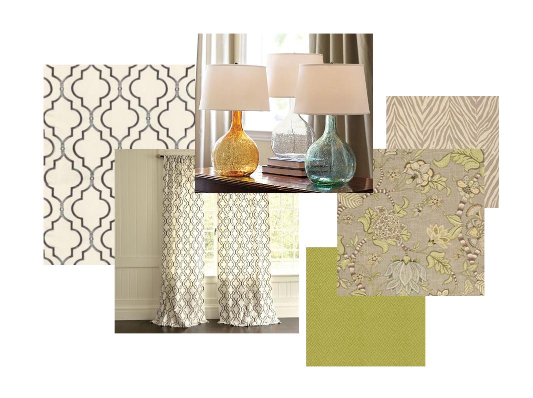
I recently had the privilege of working with a wonderful new client who asked me for help in "casting a vision" for her new living room.  Her and her husband had purchased a home, and after living in it for almost a year, it still isn't feeling like "home" to my client.  She wants to start working, room by room, and have an overall "plan" and vision to work toward.  Great idea, and I got to work creating a floor plan, and a couple of mood boards for her living room and adjoining dining room.


Although the overall scheme looks somewhat "white" in this photo, trust me, for this young family, we're upholstering those pieces in rich, kid-friendly fabrics and colors.  I'm seeing that sofa in a fresh olive green color, with one of the accent chairs in a chocolate microfiber, and the other in a chunky natural linen.  The walls will be painted Sherwin Williams "Amazing Gray", which will provide a lovely backdrop and bring in some of the gray tones in the zebra rug, and floral accent fabric.  For another hit of color, I'm seeing the backs of those shelves painted Benjamin Moore's "Stratton Blue".


My client wanted a scheme that had some personality, but was neutral enough to bring in different color tones throughout the seasons of the year.  I think a warm gray is the ideal backdrop, with the green bringing in a pop of color, but acting as a neutral with the ability to blend with blues, turquoises, ambers, violets, etc., depending on the time of year.


We also chose this gorgeous metallic damask for the adjoining dining room.  It will pair with white paneled wainscotting on the lower half of the walls, and add a hit of glamor and shine.

I'm excited to see this come together, and shop for the "finishing touches" once the room is furnished.  Its hard to show one-of-a-kind finds on these boards, but I think that's definitely what this room needs to pull it all together--a little bit of vintage, and a little bit of modern.  I'll be on the hunt!

3.31.2011

A Client Project....Starting to Take Shape

I'm working with some great clients right now on a kitchen for an old home they recently purchased.  The home is a Tudor style, and has great bones, but a crazy layout that was original to the space.  I've been working on the design with my clients for a couple of months now, and we've now decided on a final plan and all of the details are in place.  There's been a lot of constructiongoing on at their home, and now its time for the cabinets to get built and installed.  Here's a peek at what the new space will look like (I'll post before and after photos when we get to that exciting point)!


We took out a couple of walls to expand and open up this space to the dining room and breakfast area/sitting room.  Of course, we could have blown it open even more, but I think the key with some of these older homes is to open spaces to gain function, not to try to create an "open concept" floor plan--that might seem odd in a 1930's home.  I usually create about three different floor plan scenarios, and this one was the clear winner--my clients were elated to be able to fit an island into their space.  The island's asymmetry was designed to create better flow throughout the kitchen area, but it also gives a bit of an updated flavor to this older home. 


I love designing with custom cabinetry because it really allows you to hone in on the individual details.  The upper cabinets have a great tri-panel door, and all of the door and drawer panels have rails (the horizontal part of the door) that are slightly wider than the stiles (the vertical part of the door).  These details may seem small on paper, but make a completed project unique and one-of-a-kind.


Across from the main work/cooking center in the kitchen, there was a great little space that gave us the opportunity to create a pantry area and secondary prep space.  This will be nice as a coffee and serving bar when the clients have guests, and also provides much needed additional storage.  The slatted doors in the center conceal a radiator while still allowing heat to enter the space.


My favorite part of this island is those great pendant lights my clients chose--here they are in "real":


A side view of the kitchen looking in from the breakfast/sitting area.  I like all the paneling detail and custom corbels--it adds a nice formality to the space.


Here's a little smattering of a few finishes that will be used throughout the space.  All of the cabinetry is natural cherry, which is perfect for the age and style of the home.  I'm showing two cherry samples in this photo to illustrate how the wood changes and ambers (naturally) over a very short period of time once it gets installed.  The sample on the bottom is "new" cherry that has a fresh coat of finish on it.  The larger sample behind is a couple of years old, and has darkened very nicely.  This is something I like to make my clients very aware of when choosing certain woods--the color will get to what they expect it to be, but won't be there right away.  The soapstone pieces have a blackish look in the picture, but we're actually doing a gorgeous green soapstone--its going to look rich and yummy!  Complimented by oil rubbed bronze hardware and stainless steel appliances, this space is going to have a clean look that still compliments the age and tradition of the home.  Still on the list is finding the perfect backsplash tile for my clients....that's coming!