Related Posts Plugin for WordPress, Blogger...
Showing posts with label white kitchens. Show all posts

8.22.2012

Client Collaboration: Another Kitchen Beautiful

I mentioned in this post that I often have the privilege of working on kitchen and cabinetry projects that aren't my own design.  I say privilege, because I'm always honored and excited to be exposed to what others are thinking and doing, and I think that in some cases, the best final products can come out of a collaboration.  Such was the case with this project.  The install was started just before Tate was born, and the job was completed while I was on maternity leave.  I stopped by the job site after I returned to work, but things were still in upheaval with painters, floor finishers and final details getting wrapped up.  Last week, I had the chance to peek at some shots of the cleaned up and complete space......


As with other collaborations I've worked on, the floor plan and kitchen layout was done by another designer.  On this project, I worked directly with the homeowner who came to me for guidance and expertise on the cabinet design, and details related to that part of the project.  Together, we determined the right color choices for the cabinetry--a custom white with a soft, feathery glaze for the perimeter cabinets, and a custom gray with a heavier glaze and some light distressing for the island and hutch piece.


Glazed and distressed finishes are tricky, because they can easily look cheesy and dated if not done correctly.  In my experience, finding an experienced custom finisher is key to getting it right--that way, you have the ability to customize the intensity of the glazing and distressing, and aren't limited by a pre-determined glaze/distress level.  In this kitchen, the glazing is really subtle, but gives just enough definition to the cabinetry details.


One of my favorite parts of the project was the client I worked with.  Besides being just a fun and fantastic person, from the start she had a clear direction of where she wanted to go, and an impeccable taste level.  She was responsible for all of the finish selections, including the countertops and backsplash.  Isn't that marble on the island just stunning?  We added the built up/mitred edge detail to give it some extra thickness and make that area really special.


I also love my client's lighting selections, and how they add some nice punctuation to the space.  You'll notice in most of the angles that the walls have vertical painted panels.  These were original to the home, and although the space was renovated and some walls were taken down, the homeowner had the new walls paneled so that everything would match and look like it had always been there.  When renovating older homes, I think its so important to remember those types of details.  It helps the overall look and flow of the home when features like paneling, original wall texture, etc., are maintained and/or restored.


I snapped this photo before construction was complete, which is why there's a bit of a mess on the floor.  This was one of my favorite pieces of cabinetry because it was customized to fit within an awkward area under the stairs.  From the side view, the cabinet is about 12" deep, but the base drawers are actually close to 30" deep because we were able to take advantage of the under-stair depth.  The depth and height of the countertop space was customized to fit the dimensions of the homeowner's coffee machine perfectly.


Just off the kitchen is this charming, light-filled office/seating area.  Having a place like this to get work done makes paying bills much more bearable, I think!


The guest bath (lucky guests!) is just off of the kitchen as well, and ties in nicely with the overall scheme.  We made this great little vanity, which is simple and clean-lined and allows the striking marble and tile detailing to really stand out in the space.


One last look at the overall project.  I had so much fun working on this, and am grateful for the experience of being involved with such a talented team of designers, contractors and a wonderful homeowner.  Projects like this don't come along everyday, and I was blessed to learn so much through this one!

8.10.2012

Kitchen of the Week: 5 Steps to a Modern Transitional Kitchen

White kitchens are top of mind these days, and so many of them have a classic appeal, with traditional elements inspiring the design.


This kitchen shows classic inset cabinetry, a subway tiled backsplash, traditional moulding details, and restoration-style pendant lighting.  Personally, I love this look because it shows off a strong attention to detail, and a warm mix of materials that will have nice patina over time.  Same with this one:


The dark stained furniture-style island, as well as the arched valances on the toekick moulding nod toward a traditional point of view, as does the lovely crown detailing.  Trad styling can even be seen in the small details like the exposed hinges on the cabinet doors.

While I love the history and craftsmanship that a traditional space represents, and even though it seems like everyone is after a white kitchen these days, not all folks are into the classic detailing that is seen in so many of these spaces.


So what about a "modern-transitional" style?  I'm seeing a lot of this lately, and would describe it as one that has contemporary elements, but is neither completely modern, completely transitional, and certainly not traditional.  In this week's Kitchen of the Week, I thought it would be fun to discuss this style by featuring a current project done by one of my extraordinarily talented co-workers, Carol Sadowsky.  She's a designer with 30+ years experience, and I'm honored to work with her and learn from her on a daily basis.  


This newly renovated space is fresh, airy and full of light.  Contemporary detailing is a nod to a more modern aesthetic, but a balance of elements keeps it from looking too modern and spare for the young family who lives here.  

MODERN-TRANSITIONAL ELEMENT #1 - Shadowline at ceiling instead of crown moulding.
This detail could be easily overlooked, but if you imagine a traditional crown or cove moulding at the top of the upper and tall cabinets, the look would have been totally unbalanced and out of place.  Eliminating an upper moulding completely keeps a quiet, clean line.

MODERN-TRANSITIONAL ELEMENT #2 - Shaker style doors with extra-wide styles and rails
Shaker style doors have their place in many different kitchen settings, but here they add just enough detail to keep the look from going too modern and spare.  The wide (approx. 4") stiles and rails give just enough contemporary edge.

MODERN-TRANSITIONAL ELEMENT #3 - No mouldings, anywhere.
This relates to the elimination of the crown moulding, but also notice that at the island, where you'd typically see a 4" high applied base moulding, the cabinets are scribed right to the floor with a nice wide rail at the bottom.  There is no additional detailing at the wall cabinets either, where you might typically see a "light valance" moulding applied under each wall cabinet.


MODERN-TRANSITIONAL ELEMENT #4 - Fully integrated appliances.
On the far left hand side of this photo you'll notice a fully integrated fridge.  This type of application is an investment, but definitely worth it as it is the only way to get a completely flush look, keep everything on the same plane and make the fridge disappear.  Its hard to see in the photo, but to the immediate right of the fridge is a fully integrated microwave drawer.  Also a key piece that "disappears" as it sits on the same plane as the cabinet doors.  

MODERN-TRANSITIONAL ELEMENT #5 - Back painted glass backsplash
This is one of my favorite elements in the space, and one that I think is truly modern and sleek.  The soft aqua color adds some subtle contrast, but besides that, this is a quiet element that brings in a highly contemporary feel.  Add to that its SO easy to clean, and I think its the perfect choice.

Overall, the result of this kitchen is a perfectly executed mix of elements--an excellent example of modern-transitional style.  In looking at the simplicity of the space, you'd think it takes less planning, designing and attention to detail than a highly decorated and ornate traditional space.  In fact, the opposite is true.  These spaces are often the most difficult to plan and execute because the sleek and simplified nature of the design allows almost no margin for error.  It takes a skilled eye and trained design aesthetic to understand the building blocks of putting a contemporary space together, which is exactly what Carol has.

One more little sneak peek of her work......the space planning of this renovation was so well done that she was able to design in a separate office for both homeowners to work in--adjacent to the new kitchen.  Genius, and the perfect little "bonus":


Isn't this a great little space?  Small, yet functional and so sleek.  The best part--there's a door at the other end of this room, so the office mess can be hidden away at a moments notice.  I wish!

Have a great weekend!

1.12.2012

Kitchen of the Week: Beautiful Brass

Since being off of work with a new baby, I've missed getting my usual dose of pretty images related to kitchen and bath design.  I'd like to get back into it slowly, and I thought that a good way to do so would be to feature a different kitchen and/or bath each week and focus a discussion around different trends and ideas that we're seeing right now.


This kitchen, designed by Minneapolis-based designer Alecia Stevens caught my eye a while ago.  At first glance, it is a beautiful and well-balanced space, but as you look closer, there are many current trends integrated into the design.  The word "trendy" can often be perceived as negative, since it is the goal of so many designers and homeowners to have "classic" spaces that will maintain a timeless look.  Good design, however, has the ability to take a trend (however risky), integrate it into a room and almost transform the trend into looking timeless within its surroundings.  I think this kitchen takes four major current trends and does an amazing job of making them work.

1  The "White" Kitchen
White kitchens are extremely popular right now, which would qualify them as "trendy".  People ask me all the time if there's a risk associated with going with a white kitchen just because they're popular now, and I almost always say no.  First of all, if you love white cabinetry (and its right for your house), this is absolutely the direction you should go.  Second, white kitchen cabinetry has made an appearance in every decade for the past hundred years, so its not unique to this time period and should hardly be termed "trendy" for the 2000's.  Besides, its most often the style of cabinetry that gives away the decade a white kitchen came from, not the colour.

2  X-Detailing
The above kitchen uses x-mullion detailing on the refrigerator door and the cabinets on either side of the range.  While this type of detailing is showing up in a lot of places right now (and has for a while), this space utilizes the design element sparingly yet effectively.  A couple more examples of nicely integrated x-detailing:


Love, love, love this kitchen!  And isn't the integration of the x-detail at the end of the island genius?

3 Antique brass fixtures and hardware
This trend is huge, and has the ability to add the element of the unexpected to a space.  I would consider it to be somewhat risky, but again, if used properly can add warmth and patina to a room.  I think fixtures (lighting, plumbing, etc.) and cabinet hardware are great places to play with trends because they aren't impossible to change out down the road.  In the case of those brass light fixtures, I couldn't see myself ever messing with them--their scale and colour adds so much to the room!  Plus, look how this element has been carried throughout other areas of the home:


4  Patterned tile
Kitchen backplashes often fall victim to passing trends.  Either that, or they seem to be areas where designers and homeowners get over-creative and pull in odd combinations of accent tile, mosaics, etc. and actually take away from what's happening in the rest of the kitchen.  Not the case here.  This is a perfect example of how to use an intricate and unique tile, and make it a feature that doesn't dominate the space.  The key is that the tile was applied as a full height backsplash, and only one pattern was chosen.  There are no annoying borders or insets, and the repetition is what creates drama and impact.  


Same with the floor tile.  The black and white is uncomplicated, classic, and provides a beautiful transition into an adjoining room.  Plus, it subtly echos the x-pattern on the cabinet doors, giving it context and purpose.

So what do you think?  Does this kitchen score points for its marriage of "classic" and "trendy"?  Click here for more photos of this entire home.  I could move in to this space tomorrow!  

10.05.2011

Why Does Everyone Want a White Kitchen?

I haven't chatted about kitchen design for a while now, and since the arrival of a new bundle (of joy!) will probably take center stage for the next little while, I wanted to take the opportunity (while I have it) to talk about something career-related.  White kitchens have been "on trend" for a while now, and they seem like the right choice for so many interior spaces.  Besides the obvious though, why is it that this is now the go-to for homeowners and designers alike?


1.  Designers are still excited about white.  When I see a beautiful white kitchen, my heart beats just a little bit faster.  When clients come to me asking for white kitchens, I never tire of the request, and look forward to pulling together all of the elements that will make their "white" kitchen a success.  I'm not even sure I can pinpoint an exact reason, but I think it has something to do with white's ability to be the perfect backdrop, while at the same time being the star of the show and setting a tone for the entire space.


2.  Everyone wants what everyone else has.  While I realize that this is a major generalization, I do see the "white" trend driving more of the same trend.  This look probably won't be popular forever, but for the moment it has a captive audience that continues to breed more and more interest.  But really, who wouldn't want to live in this white-on-white kitchen pictured above?

Pinterest/Kitchen designed by Mick de Giulio

3.  There's a sense of the "non-committal"--in a good way--when you choose white.  In a way, white is the perfect choice for those who are afraid to commit to a color or wood species that they might tire of in a few years.  However, instead of defaulting like we sometimes do by painting all of our walls white because we're overwhelmed by all of the choices, white kitchens don't have the yawn factor that white walls can.  There's so much opportunity for layering of textures and materials in a white kitchen (think glossy white backsplash tile with silky smooth honed marble countertops), that the end result is anything but monotonous.  Add to that the dimension and depth you get from paneled doors, moulding details and wall paneling, and an all-white kitchen can really come alive.  Now the only choice is what shade of white to go with.......:)


4.  White is versatile and complimentary, making it easy to transition to other colors and finishes.  I love the kitchen pictured above.  It has an abundance of lightness and brightness, definite injections of white, but is perfectly balanced by the addition of that gorgeous smokey charcoal color.  In the same way, white can be the perfect partner if your mood changes with the seasons and you like to incorporate bold shots of accent color.  It allows you to experiment with different colors, wood species and finishes, and add a dose of something different without completely straying from classic white, like in the kitchen below.


5.  With white, you have the opportunity to inject the unexpected, and have it really stand out.  Because white is so common right now, spaces that incorporate white with some more uncommon elements can really steal the show.  This kitchen above is one of my all time favorites--the white cabinetry and coffered ceiling are beautiful in and of themselves, but also provide the perfect backdrop for those steel-framed french doors--they punctuate that back wall and guide my eye easily through the space.  The herringbone pattern on the floor is another unexpected element, and really elevates this kitchen to a level of high design and well thought out detail.

There you have it.  My thoughts on why white continues to be the new white :)  How about you?  What reasons do you have for choosing a white kitchen?

1.12.2011

My New Kitchen: A Favorite 2010 Project Revealed!

Since this is my official week back at work from "Christmas vacation" it sort of feels like New Year's just happened, and its the beginning of the year for me.  I'm looking forward to a productive and rewarding 2011, and hoping that I can stick to some of my resolutions.  I'm the kind of girl with an ongoing "to do" list and I love projects.  However, I also get overambitious and have a tendency to keep adding new things without first completing the old ones.  I'm resolving this year to be a little more strict with myself, and not let my creative mind wander all over the place before finishing the tasks at hand.  That said, I'm looking back to my favorite completed project of 2010, hoping to be inspired by the work that was done, and motivated to keep going and make my little "cottage" feel more and more like home.  Hope you enjoy the transformation!


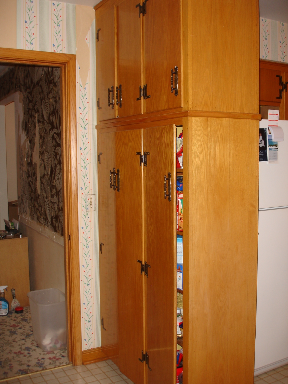
Even though this kitchen was tired and in desperate need of modernization, it had such nostalgia and charm.  The family who lived here for 40 years previous to us buying the home had been great hosts, and welcomed countless guests into their home.  I know this little kitchen worked very hard to produce wonderful meals and create meaningful fellowship among friends and family.  Needless to say, I was glad to get rid of the golden oak cabinets, wallpaper, laminate flooring, and quirky layout!


Here are a couple of drawings I did to conceptualize the space.  These are the ones I settled on as the final design, but I did multiple layouts and design plans during the initial stages.  I usually do this with client projects as well--there are often many ways to achieve a well-designed layout, and the hybrid of a few ideas can form a great final design.


Here it is.....the finished product!  I'm pretty excited about how it all came together, and at how drastically transformed the space was.  The major things we did were removing the wall that separated the dining room from the kitchen, and removing two small kitchen windows in order to add one large one.  This opened the space up tremendously, but still respected the age and existing layout of the home.  Open concept homes have been a trend for a few years now, but I'm noticing that trends are moving toward floor plans that are more compartmentalized.  This house needed to maintain some separation, and opening up just one wall keeps things proportionate while still adding an airy feel.


It wasn't hard to decide on the cabinet color, given my love of white kitchens.  I opted for a door style that is a little more contemporary, adding pilasters that come to the floor to give the base cabinets a more unique look.  The overall feel is kind of "bistro-modern", using classic elements like honed granite, marble and polished nickel, and mixing them with contemporary lines and cool stainless steel.  That little island is an IKEA find, and is just the right size.  My kitchen didn't have the width for a traditional island with seating, but still needed something for additional work space and storage.  I bought this one, and had a marble remnant cut to fit the top to make it look a little more customized.


And finally, here's the kitchen "in use" by my precious little niece.  That little sink was the perfect size for her "bathtub".........I love her to pieces, and think it doesn't get much cuter than this!

Thanks for checking out my new space.  Cheers to a great start to 2011, and may it hold lots of new design adventures and completed projects!

10.27.2010

White Kitchens: What Everyone Should Know

White is the new white. This is a kitchen scheme that is not going anywhere anytime soon. Which in my eyes is a good thing because it allows us to create kitchen spaces that are classic and timeless--or at least in our 21st-century eyes "timeless". With this in mind, I thought I'd offer a few pieces of advice to keep in mind when pursuing your dream of a white kitchen.

1. Finish is everything.
There are many ways to achieve the color "white", but quality and proper finishing techniques are critical when it comes to creating a white that will stand the test of time.  Professional finishes can range from those that are factory-finished (in the case of box cabinets), shop finished (in the case of custom cabinets), or site finished (in the case of custom and existing cabinetry).  There are distinct features to every process, and every cabinetry type will have its own set of pros and cons.  Because white can be unforgiving in many ways, do your research and make sure you understand the type of finish and the process that will be used in the application you choose.


2. Choose your white carefully
All whites are not created equally, and what looks great in the showroom or on the paint chip may not be the "right white" in your home. A professional designer should always provide expert advice, as well as adequate color sampling to ensure the white is right for your space. Once your cabinets are in, this is an expensive and difficult thing to change, so its important to get it right the first time!

4. Consider a secondary color
There's certainly nothing wrong with doing an all-white color scheme--if you like white, embrace it.  Keep in mind though, that white is less forgiving than other finishes, and depending on your lifestyle can show wear over time.  It may be wise to consider a secondary color or wood species at an island space.  If you have an area that will be the "hub" of entertaining, food prep, and gathering, a darker finish or harder wood could be just the thing to hide life's wear and tear situations.

5. Layer in texture
Either visual or tactile, to add interest and dimension to an all white color scheme. You can do this in subtle, yet effective ways through the use of backsplash material, countertop surfaces or textiles within the space.

Click here for some additional great color advice (and more beautiful photos) on white kitchens.