Related Posts Plugin for WordPress, Blogger...
Showing posts with label Kitchens. Show all posts

9.21.2012

Client Work: A Beautiful Finish!

I posted here about free-standing islands and a sneak peek on one I designed for some clients recently.  I stopped by the other day to check on progress and see the newly installed countertops.  Here's what the island looked like in progress:


And here are a few quick shots I took with my phone to show the finished product:


The countertops are Cambria's Whitecliff, and I think they're stunning.  If I could have a do-over in my own kitchen I would definitely use this product.  For one, its the cleanest, most true "white" solid surface out there, and its dead sexy.  Crisp and modern, but can work in a more classic setting as well.


On that note, lets take a minute and have a conversation about solid surface products.  Cambria, Caesarstone and Hanstone are a just a few of the manufacturers of this type of product, which essentially is a man-made surface that incorporates natural quartz, resin, pigment, and some other "top secret" ingredients.  I know this because I've toured the plant where they make Cambria {fascinating}, and there are several areas we're not allowed to see because of their top-secret-ness.  Anyways, I heard recently that solid surface products, particularly Cambria, are becoming so popular that in certain parts of the country they're more in demand than granite.  I think its near impossible to truly replicate the beauty and movement found in natural stone, but Cambria has a great offering of interesting patterns and colors that can be an alternate to granite or marble, if you're looking for something different that's really durable.


Quartz products bring to the table incredible stain, scratch and heat resistance, which makes them a top choice in many applications.  Cambria is completely non-porous, which means it can't trap germs, and the potential for bacteria growth is greatly reduced.  And no, I'm not a spokesperson for the product, I've just used it in several applications and like it a lot :)

All that said though, I still think that there is no true substitute for natural stone, and if you're looking for quartz to give you the exact look and feel and deliciousness of true marble, you'll be disappointed and sad.  There are great marble alternates, like Cambria Torquay, and if you like it and can appreciate it for what it is (and what its not), you'll be happy with your choice.  Or you could have the best of both worlds, like my client and I did in this kitchen:


Its a mix of Cambria Fieldstone on the perimeter cabinets, and a luxurious Calcutta Gold marble on the island.  A great way to incorporate durability and beauty within the same space.

So what do you think?  Do you see quartz products taking the lead over granite and/or marble in your area?  Or is natural stone still where its at?


9.04.2012

When Is Granite the Right Choice?

Granite has gotten a bad rap, at least in my neck of the design industry.  For years, it was a top choice when it came to stone surfaces, and because everyone had to have it, I think it got undeserved reverence and distinction.  Homeowners expect that any house they look at buying would have stainless appliances and granite countertops as "standard", which I think is hilarious because nine times out of ten the granite installed to sell these homes is hideous, and the "stainless" appliances aren't even real stainless steel.  What was once a pricey upgrade has become too commonplace, and now the overkill, as well as the availability of inexpensive and unattractive types of granite has made it a lesser choice.

(the granite isn't the only problem with this bathroom, but it's definitely a contributing factor.  Yikes.)

I'm mostly sick of seeing granite, and no longer recommend it to clients who are doing new kitchens or baths.  However, all that negative stuff said, there is such beauty in natural materials, and I do believe that granite is still the right choice in certain applications.

1  CONSIDER THE AGE OF THE HOME
The age and aesthetic of the home can (and often should) dictate many of the design decisions, especially when it comes to materials.  Since granite has gained most of its popularity since the mid-90's, it looks out of place to slap a heavily figured or speckled slab in a 20's or 30's era home.  That said, it can often be the right thing to add to a 90's era/early 2000's oak or cherry kitchen because these spaces were often built in the time period when granite was popular.  A perfect example of this is my parent's kitchen, where they recently replaced their builder-grade laminate with granite, and installed a backsplash where there previously had just been painted sheetrock.  Their kitchen is the classic early 2000's red oak, and naturally it has yellowed over time to a golden tone.


The space was an excellent candidate for granite, because my parents still love the oak, and keep their home in immaculate condition, so the kitchen looks like new.  I wish I could keep my house in the shape my mom keeps hers......maybe someday I'll uncover the "neat and organized" gene that's hiding deep within :)  Also, many types of granite have golden, caramel and butterscotch veining, which tie in with the tones in oak, coordinating the look and making it intentional.


The backsplash looks quite greenish in these photos, but in reality has a nice neutral golden tone that compliments the granite perfectly.  We found this beautiful glass/ceramic crackle tile, and did it full height in all areas with a liner bar running about five inches up.  This was intentional because we had to add a short side splash at the walls on either end of the countertops, and the liner caps off the unfinished top edge of the tile, continuing through for a seamless transition.

2  CONSIDER THE VISUAL TEXTURE IN THE REST OF THE ROOM
Granite can be the perfect choice when it compliments and adds to other visually textural elements in the rest of the room.  If done incorrectly this can look like chaos, but when executed properly, the patterning and interest in a granite surface can add richness and harmony.


The lighter tones and delicate veining seen here are a beautiful compliment to the stone hood surround and backsplash.  Additionally, they compliment the rich grain pattern in the wood cabinetry.


This exotic looking granite is perfect with the depth, color and texture of that copper sink.  It also is a complimentary element to the glazed and distressed cabinetry, and gives a jumping point for the color of the oil rubbed bronze fixtures and hardware.

3  CREATE A BEAUTIFUL JUXTAPOSITION OF ELEMENTS
With granite often used in more traditional applications, its easy to overlook its place in a more modern and streamlined interior:


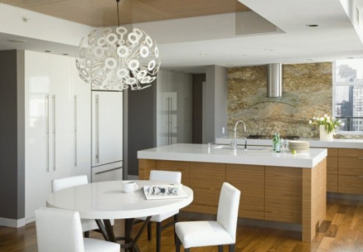
I'm not 100% sure if that gorgeous wrapped island countertop is granite (it could be marble), but it adds the perfect amount of texture to contrast with the other sleeker elements in the space.  I also love how it references the wood countertops and flooring, using those elements as inspiration for the rich caramel color. 


I LOVE this kitchen, and if anyone knows who designed it and where I can see more images, please let me know!  There couldn't have been a more perfect choice than a heavily patterned granite for that full height backsplash.  It makes all of the other elements in the kitchen stand out even more, and brings such prominence and importance to that end of the kitchen.  What a great way to draw the eye into this amazing gathering space.

4  REMEMBER THAT GRANITE IS A UNIQUE AND PERSONAL CHOICE
The patterning and veining found in many types of granite is so unique that I think its almost impossible to think that the next set of homeowners will have the same taste as yours.  If you are in your forever house, and want the finishes personalized to your taste, granite is a great choice.  If you are looking at resale anytime in the future, think of a heavily patterned granite the same as you'd think of a bold floral sofa--probably not going to suit the tastes of the next owners.  Consider a more neutral countertop option, because you can take that floral sofa with you, but the granite will be inherited by the next owners.


5  GO FOR GRANITE AS A GREAT NEUTRAL
I've talked mostly about the heavily colored and patterned granite types, but beyond those there are a couple that are real stand outs when it comes to creating a more neutral scheme.

This kitchen is beautifully done, and it would have been easy to default to the ever-popular Carrara marble as a countertop choice.  Instead, they've used something similar to Kashmir White, and I think it adds quiet texture and interest--not to mention better stain resistance than marble.  Because the granite choice is so neutral and complimentary to the rest of the finishes it would likely appeal to a wide variety of homeowners.


Finally, I love the contrast that a honed black granite gives to white cabinets, and chose this material in my own kitchen.  The honed (matte) finish takes the edge off, and is easy to maintain.  Be warned about seeing every little crumb and spec of dust though......I've learned this firsthand!

So after pulling this post together, I'm much more calm and less hateful toward granite.  Seeing it done properly, and knowing that this beautiful natural material has its place opens up a world of possibility.  Maybe I'll use it in my next client project.  Or at least consider it :)

8.22.2012

Client Collaboration: Another Kitchen Beautiful

I mentioned in this post that I often have the privilege of working on kitchen and cabinetry projects that aren't my own design.  I say privilege, because I'm always honored and excited to be exposed to what others are thinking and doing, and I think that in some cases, the best final products can come out of a collaboration.  Such was the case with this project.  The install was started just before Tate was born, and the job was completed while I was on maternity leave.  I stopped by the job site after I returned to work, but things were still in upheaval with painters, floor finishers and final details getting wrapped up.  Last week, I had the chance to peek at some shots of the cleaned up and complete space......


As with other collaborations I've worked on, the floor plan and kitchen layout was done by another designer.  On this project, I worked directly with the homeowner who came to me for guidance and expertise on the cabinet design, and details related to that part of the project.  Together, we determined the right color choices for the cabinetry--a custom white with a soft, feathery glaze for the perimeter cabinets, and a custom gray with a heavier glaze and some light distressing for the island and hutch piece.


Glazed and distressed finishes are tricky, because they can easily look cheesy and dated if not done correctly.  In my experience, finding an experienced custom finisher is key to getting it right--that way, you have the ability to customize the intensity of the glazing and distressing, and aren't limited by a pre-determined glaze/distress level.  In this kitchen, the glazing is really subtle, but gives just enough definition to the cabinetry details.


One of my favorite parts of the project was the client I worked with.  Besides being just a fun and fantastic person, from the start she had a clear direction of where she wanted to go, and an impeccable taste level.  She was responsible for all of the finish selections, including the countertops and backsplash.  Isn't that marble on the island just stunning?  We added the built up/mitred edge detail to give it some extra thickness and make that area really special.


I also love my client's lighting selections, and how they add some nice punctuation to the space.  You'll notice in most of the angles that the walls have vertical painted panels.  These were original to the home, and although the space was renovated and some walls were taken down, the homeowner had the new walls paneled so that everything would match and look like it had always been there.  When renovating older homes, I think its so important to remember those types of details.  It helps the overall look and flow of the home when features like paneling, original wall texture, etc., are maintained and/or restored.


I snapped this photo before construction was complete, which is why there's a bit of a mess on the floor.  This was one of my favorite pieces of cabinetry because it was customized to fit within an awkward area under the stairs.  From the side view, the cabinet is about 12" deep, but the base drawers are actually close to 30" deep because we were able to take advantage of the under-stair depth.  The depth and height of the countertop space was customized to fit the dimensions of the homeowner's coffee machine perfectly.


Just off the kitchen is this charming, light-filled office/seating area.  Having a place like this to get work done makes paying bills much more bearable, I think!


The guest bath (lucky guests!) is just off of the kitchen as well, and ties in nicely with the overall scheme.  We made this great little vanity, which is simple and clean-lined and allows the striking marble and tile detailing to really stand out in the space.


One last look at the overall project.  I had so much fun working on this, and am grateful for the experience of being involved with such a talented team of designers, contractors and a wonderful homeowner.  Projects like this don't come along everyday, and I was blessed to learn so much through this one!

8.07.2012

Client Progress & Free Standing Islands

Creating an unfitted, "furniture look" is hot in kitchen design right now.  Clients are wanting to add interest to their spaces by having things look less matched, which I think is a good thing when done properly.  I'm not a big fan of highly contrasting cabinetry within the same space, and find that things can look contrived when perimeter cabinets and islands are completely different from one another.  I think that there has to be a unifying element, whether it be the countertop material, cabinetry color, or other detail.  Once you've established that element, then you can play around with other unique added details.


While there is a lot of contrast going on in this space, I think the uniqueness of the island is appropriate and well-appointed.  The cabinetry and countertop match that of the perimeter bases, and add a much-needed dark element to balance with the depth of the backsplash.  The horizontal slatted look is the stand-out feature, but since the unifying elements were properly established and repeated, the look is intentional and well-designed.

I'm working on a project right now with some great and highly stylish clients.  They started their kitchen renovation and the homeowner built his own cabinetry (and did an amazing job, I might add) along one perimeter wall.  It looks fabulous, but they came to me a few months ago seeking help in designing the rest of their space.  They were stumped at how to effectively space plan, and needed another pair of eyes to guide them through the rest of the renovation.  We came up with a plan that actually eliminated two walls, and allowed for a functional working island--something that would not have been possible had we not opened up the space.  Even though the space was opened up though, the homeowners wanted to keep an airy feeling, giving the island a furniture-feel even though it would be a stationary piece.  After several versions and revisions, this is what we came up with, and it was installed last week:


The countertops (which will match the perimeter tops) have yet to go in, but I LOVE how this is looking so far.  The horizontal panel look, as well as the color (Benjamin Moore Chelsea Gray) are unique to this piece, but the walnut base and the cabinet door style tie in with other elements in the kitchen.  Here's a look at the other side:


The exposed walnut roll outs are repeated on the perimeter, and add richness and an organic element.  I'll be sure to post more photos as the project progresses, but thought it was worthy of a sneak peek!

So with the free standing look being so popular right now, I thought I'd do a quick roundup of some of the prefab options that are available out there.  Its always nice to be able to design something from scratch that is specific and unique to the space, but I was surprised at how many affordable and stylish options that are out there.  Additionally, with most of these pieces it would be easy to identify a unifying element, and integrate them with your existing space at a fraction of the cost of custom cabinetry.


From Williams Sonoma, this one speaks to the weathered/reclaimed look that is so popular right now.  It has a dark stone top though, which is a classic finish that could be repeated elsewhere.  I think it would look great with white cabinetry in a space that also has a chalkboard wall in a prominent place.  Plus, this piece would get better with a little wear and tear--family friendly!


Also from Williams Sonoma, this piece is classic and unfussy.  Sure to blend with all of the white marble kitchens that are going on right now.


Love this clean, utilitarian look that echos the stainless appliances.  Perfect in the space.  You can get the look here:


Or a less expensive version here:


This one from Crate & Barrel is one of my favorites, and I would have loved if it worked in my kitchen.  The dimensions were too large, but what I like is how delicate and simple this piece is.  It has style and substance, but doesn't take up a ton of visual space.


This is actually a 31" high console table, but with the addition of a few inches of countertop material, it could be easily modified to bring it up to a 36" island height.  I love the industrial nature of the piece, and think it could take some abuse in a kitchen and still look good with a few years of wear.  Find it here.


Ballard Designs has a nice version that looks more like a built in piece.  Simple with a nice combination of drawers and open storage.  I bet you could easily swap out the butcher block countertop for a piece of stone.

  
Same with this one.  Its inexpensive, and has durable stainless shelves.  I ended up getting this for my own kitchen, and replacing the top with a marble remnant, which ties in with my backsplash.  I extended the overhangs on each end to give myself additional surface area:


Check back for more progress on that client project I was talking about, and hopefully I've given you some ideas on adding that furniture look to your existing space!

2.29.2012

Client Reveal: Kitchen of the Week

A long while back, I posted here about a fabulous client before and after project that I designed last year.  I've been waiting to get it professionally photographed, and the time has finally come--the photos are in!  This project is a career highlight for me, both in the transformation of the space, and in the great relationship and collaboration I was able to have with these clients.  I truly believe that a successful project is the result of good communication and an honest working relationship, which I felt I had with these wonderful, stylish and intelligent clients!  Here's a look at what the space was like when my clients purchased the home--it was dated, segmented and related poorly to the rest of the home:


And here is the new space:


In designing this kitchen, along with reworking the back entry, staircase, and the guest room hallway, we looked at many different floor plan options before settling on this one.  Usually I like to present clients with a few different design scenarios so they can see what could be, and in the end, what works best for their space and their needs.  Here's my take on why this design works best, and why I think it will serve the home and the homeowners for years to come.

1  Open, but not too contemporary
I definitely think there's an urge these days to create open and free-flowing space within a home.  In many cases, this can dramatically improve the everyday use of the space, the way that family interacts and congregates in the home, and the way homeowners are able to entertain guests.  Older homes are notorious for having kitchens that are completely cut off from the rest of the home, and while these spaces often benefit from being opened up, the temptation to get rid of all the walls and create one large room can prove disastrous in a period home.  In this space, we combined two smaller rooms to create a kitchen and seating area, and also opened up the wall to the dining room.  However, the addition of trim and casing that matches the rest of the house defines the new opening, making it look planned and part of the original design--not like we just cleared out all of the walls for the sake of a more open floor plan.

2  Material choices that read as "period-appropriate", rather than "on trend"
With this home being built in 1931, we wanted to incorporate modern convenience and good design sense while still respecting the age and character of the house.  A typical 1930's kitchen (in its original state) might have had painted cabinets, but for this space we took our cues from the warmth of the original dark wood mouldings and trim, as well as the natural oak floors.  The cabinetry is natural cherry, which is a lovely wood species to use because it marries well with other wood tones in the space.  Cherry also mellows and darkens with age, and over the years will develop its own beautiful character.


Another period appropriate material choice are the soapstone countertops.  Soapstone has been used for centuries as a durable surface for high-use areas.  It is non-porous, so won't stain or trap bacteria, and is so resistant to chemical abrasion and acidic foods that its a preferred surface in chemistry labs.  Plus, it has a natural, organic beauty, and no two slabs are alike.  A classic element is also found in the backsplash, which is composed of elongated subway tiles that pick up on the beautiful green hue in the soapstone.


3  Floor plan that emphasizes style and function
A successful part of this design is the way that the layout works well for two or for twenty.  The kitchen is essentially a galley style, with the sink, range, and refrigerator placed adjacent to, or directly across from one another.  A large island allows for comfortable prep space when two people are working in the kitchen, while the seating and additional beverage center/buffet create another work area for the homeowner, and keep guests out of the main prep space.  The gentle curve of the island adds an element of modernity, while naturally guiding traffic toward a comfortable seating area at the other end of the room--a space designed to enjoy a morning cup of coffee, or casual conversation while entertaining friends.


So that's the tour!  I could go into much greater depth about all of the details and planning that went into making this space a success, but I'll let the pretty pictures speak for themselves.  As I mentioned before, this is a most favorite project of mine, and I hope it results in many great years of good living for these wonderful clients.

1.12.2012

Kitchen of the Week: Beautiful Brass

Since being off of work with a new baby, I've missed getting my usual dose of pretty images related to kitchen and bath design.  I'd like to get back into it slowly, and I thought that a good way to do so would be to feature a different kitchen and/or bath each week and focus a discussion around different trends and ideas that we're seeing right now.


This kitchen, designed by Minneapolis-based designer Alecia Stevens caught my eye a while ago.  At first glance, it is a beautiful and well-balanced space, but as you look closer, there are many current trends integrated into the design.  The word "trendy" can often be perceived as negative, since it is the goal of so many designers and homeowners to have "classic" spaces that will maintain a timeless look.  Good design, however, has the ability to take a trend (however risky), integrate it into a room and almost transform the trend into looking timeless within its surroundings.  I think this kitchen takes four major current trends and does an amazing job of making them work.

1  The "White" Kitchen
White kitchens are extremely popular right now, which would qualify them as "trendy".  People ask me all the time if there's a risk associated with going with a white kitchen just because they're popular now, and I almost always say no.  First of all, if you love white cabinetry (and its right for your house), this is absolutely the direction you should go.  Second, white kitchen cabinetry has made an appearance in every decade for the past hundred years, so its not unique to this time period and should hardly be termed "trendy" for the 2000's.  Besides, its most often the style of cabinetry that gives away the decade a white kitchen came from, not the colour.

2  X-Detailing
The above kitchen uses x-mullion detailing on the refrigerator door and the cabinets on either side of the range.  While this type of detailing is showing up in a lot of places right now (and has for a while), this space utilizes the design element sparingly yet effectively.  A couple more examples of nicely integrated x-detailing:


Love, love, love this kitchen!  And isn't the integration of the x-detail at the end of the island genius?

3 Antique brass fixtures and hardware
This trend is huge, and has the ability to add the element of the unexpected to a space.  I would consider it to be somewhat risky, but again, if used properly can add warmth and patina to a room.  I think fixtures (lighting, plumbing, etc.) and cabinet hardware are great places to play with trends because they aren't impossible to change out down the road.  In the case of those brass light fixtures, I couldn't see myself ever messing with them--their scale and colour adds so much to the room!  Plus, look how this element has been carried throughout other areas of the home:


4  Patterned tile
Kitchen backplashes often fall victim to passing trends.  Either that, or they seem to be areas where designers and homeowners get over-creative and pull in odd combinations of accent tile, mosaics, etc. and actually take away from what's happening in the rest of the kitchen.  Not the case here.  This is a perfect example of how to use an intricate and unique tile, and make it a feature that doesn't dominate the space.  The key is that the tile was applied as a full height backsplash, and only one pattern was chosen.  There are no annoying borders or insets, and the repetition is what creates drama and impact.  


Same with the floor tile.  The black and white is uncomplicated, classic, and provides a beautiful transition into an adjoining room.  Plus, it subtly echos the x-pattern on the cabinet doors, giving it context and purpose.

So what do you think?  Does this kitchen score points for its marriage of "classic" and "trendy"?  Click here for more photos of this entire home.  I could move in to this space tomorrow!