Related Posts Plugin for WordPress, Blogger...
Showing posts with label My Work. Show all posts

9.27.2012

Oh My Goodness.......I WON!!!

I have some great news to share this week!  Remember this kitchen?  I blogged about it here.  It is one of my favorite projects and transformations to date, and my clients were/are simply fabulous and so much fun to work with.


Well, back in July, I entered this project in a Minnesota state-wide design competition, sponsored by Midwest Home magazine, and the National Kitchen and Bath Association.  The entry process is detailed, and the designs are meticulously judged on design, overall transformation, aesthetic, and attention to NKBA design standards and guidelines.  After we submit entries, we get to sit in anxious anticipation until mid-September when there is a big awards gala, and we find out if we won (or didn't win) in front of a large gathering of our contemporaries in the design industry.  Kind of nerve-wracking.  So last week, I got all dressed up, enjoyed a fancy dinner and presentation and waited until they got around to announcing the winners.


There are three categories for kitchens--small, medium and large.  This kitchen, although it lives quite large and comfortable, is actually considered "small" in terms of square footage.  I sat on the edge of my seat, and as they called the second place winner, I thought "oh well, maybe next year."  Then, my photo popped up on the screen, next to a photo of this kitchen, and in a moment of disbelief I realized that I'd won first place!!


Its a great feeling to be validated for your hard work, and I'm excited for my clients, and even more elated that this project will be part of a feature in Midwest Home Magazine next month.

Thanks for sharing in my good news!

9.21.2012

Client Work: A Beautiful Finish!

I posted here about free-standing islands and a sneak peek on one I designed for some clients recently.  I stopped by the other day to check on progress and see the newly installed countertops.  Here's what the island looked like in progress:


And here are a few quick shots I took with my phone to show the finished product:


The countertops are Cambria's Whitecliff, and I think they're stunning.  If I could have a do-over in my own kitchen I would definitely use this product.  For one, its the cleanest, most true "white" solid surface out there, and its dead sexy.  Crisp and modern, but can work in a more classic setting as well.


On that note, lets take a minute and have a conversation about solid surface products.  Cambria, Caesarstone and Hanstone are a just a few of the manufacturers of this type of product, which essentially is a man-made surface that incorporates natural quartz, resin, pigment, and some other "top secret" ingredients.  I know this because I've toured the plant where they make Cambria {fascinating}, and there are several areas we're not allowed to see because of their top-secret-ness.  Anyways, I heard recently that solid surface products, particularly Cambria, are becoming so popular that in certain parts of the country they're more in demand than granite.  I think its near impossible to truly replicate the beauty and movement found in natural stone, but Cambria has a great offering of interesting patterns and colors that can be an alternate to granite or marble, if you're looking for something different that's really durable.


Quartz products bring to the table incredible stain, scratch and heat resistance, which makes them a top choice in many applications.  Cambria is completely non-porous, which means it can't trap germs, and the potential for bacteria growth is greatly reduced.  And no, I'm not a spokesperson for the product, I've just used it in several applications and like it a lot :)

All that said though, I still think that there is no true substitute for natural stone, and if you're looking for quartz to give you the exact look and feel and deliciousness of true marble, you'll be disappointed and sad.  There are great marble alternates, like Cambria Torquay, and if you like it and can appreciate it for what it is (and what its not), you'll be happy with your choice.  Or you could have the best of both worlds, like my client and I did in this kitchen:


Its a mix of Cambria Fieldstone on the perimeter cabinets, and a luxurious Calcutta Gold marble on the island.  A great way to incorporate durability and beauty within the same space.

So what do you think?  Do you see quartz products taking the lead over granite and/or marble in your area?  Or is natural stone still where its at?


8.17.2012

Bananastrudel & My Bathroom

I came across the Etsy shop Bananastrudel when I was working on Tate's Nursery.  It is filled with vintage maps, prints, lithographs--you name it.  There is a ton of subject matter to choose from, and the shop owners have done a wonderful job curating many beautiful frameable items.  I like to visit often because there are always new things popping up.  A while back, I found two beautiful botanicals and purchased them right away, knowing I had the perfect spot for them:


They arrived in the mail beautifully and carefully packaged--it was such a treat to open and find goodies and even a handwritten thank you note inside.  These guys know customer service!


I've had these framed prints for years and years.  I worked in a custom framing shop during college (LOVED that job), and ended up with some nice artwork after my time working there.  As for these prints, I liked them at the time because they are sort of architectural, but now I think its kind of dorky that I chose them.  I believe that art should be personal and reflect something about us, and I've never been to France or England, so why do I have these hanging on my wall.  Good question.


I love the frames with their subtle gold detailing, and although they were custom, they were the exact right size for my Bananastrudel botanicals.


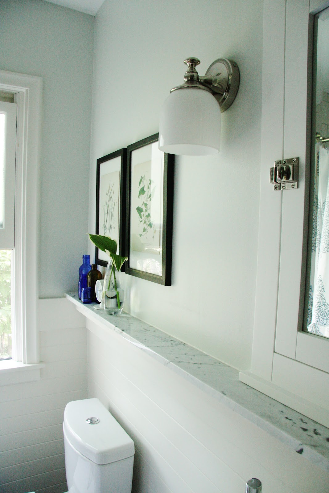
The mats wouldn't work, but I wanted to do something different anyways, so I just mounted the prints on off-white foamcore using some 1/8" thick adhesive foam strips to "lift" them off of the foamcore a bit.  Here they are, nicely filling some blank wall space in my newly renovated bathroom (photos of that coming.....hopefully soon):


The prints themselves are of wild buckwheat and wild oats.  They remind me of home--Saskatchewan, Canada, where grain farming is abundant.


A tiny sneak peek of part of the bathroom.  The ledge is Cararra marble, and is wonderful as extra "counter space".  The toilet is an Aquia Dual Flush by Toto.  Best looking, functioning, and easiest to clean toilet ever, and I recommend it all time.  Check out some before shots of this bathroom here, and as I said, a complete reveal is coming soon.


Accessorizing in the bathroom is fun, but things get covered in that dust/towel lint so quickly!  This is our primary bathroom right now, and its hard to keep all of the hard surfaces and collectibles dust-free.  Especially if you're me, and you haven't figured out why your house seems so dirty all the time and everyone else's seems so clean.  Something I wonder about all the time :)


The blue bottles are antique apothecaries that my parents-in-law dug up in a friend's backyard years ago.  Quite the find, and I love how they look displayed in a collection.  The brown bottles are part of a much larger collection that I amassed while working for many years with my pharmacist dad in his dispensary.  I like the history that these things suggest--medicine typically doesn't come in glass bottles anymore.


And for a modern touch, this little clock from West Elm is the perfect size and shape.  Took me a while to find something that would work here, and for $12, I'm more than excited about this one!

Have a great weekend!

2.29.2012

Client Reveal: Kitchen of the Week

A long while back, I posted here about a fabulous client before and after project that I designed last year.  I've been waiting to get it professionally photographed, and the time has finally come--the photos are in!  This project is a career highlight for me, both in the transformation of the space, and in the great relationship and collaboration I was able to have with these clients.  I truly believe that a successful project is the result of good communication and an honest working relationship, which I felt I had with these wonderful, stylish and intelligent clients!  Here's a look at what the space was like when my clients purchased the home--it was dated, segmented and related poorly to the rest of the home:


And here is the new space:


In designing this kitchen, along with reworking the back entry, staircase, and the guest room hallway, we looked at many different floor plan options before settling on this one.  Usually I like to present clients with a few different design scenarios so they can see what could be, and in the end, what works best for their space and their needs.  Here's my take on why this design works best, and why I think it will serve the home and the homeowners for years to come.

1  Open, but not too contemporary
I definitely think there's an urge these days to create open and free-flowing space within a home.  In many cases, this can dramatically improve the everyday use of the space, the way that family interacts and congregates in the home, and the way homeowners are able to entertain guests.  Older homes are notorious for having kitchens that are completely cut off from the rest of the home, and while these spaces often benefit from being opened up, the temptation to get rid of all the walls and create one large room can prove disastrous in a period home.  In this space, we combined two smaller rooms to create a kitchen and seating area, and also opened up the wall to the dining room.  However, the addition of trim and casing that matches the rest of the house defines the new opening, making it look planned and part of the original design--not like we just cleared out all of the walls for the sake of a more open floor plan.

2  Material choices that read as "period-appropriate", rather than "on trend"
With this home being built in 1931, we wanted to incorporate modern convenience and good design sense while still respecting the age and character of the house.  A typical 1930's kitchen (in its original state) might have had painted cabinets, but for this space we took our cues from the warmth of the original dark wood mouldings and trim, as well as the natural oak floors.  The cabinetry is natural cherry, which is a lovely wood species to use because it marries well with other wood tones in the space.  Cherry also mellows and darkens with age, and over the years will develop its own beautiful character.


Another period appropriate material choice are the soapstone countertops.  Soapstone has been used for centuries as a durable surface for high-use areas.  It is non-porous, so won't stain or trap bacteria, and is so resistant to chemical abrasion and acidic foods that its a preferred surface in chemistry labs.  Plus, it has a natural, organic beauty, and no two slabs are alike.  A classic element is also found in the backsplash, which is composed of elongated subway tiles that pick up on the beautiful green hue in the soapstone.


3  Floor plan that emphasizes style and function
A successful part of this design is the way that the layout works well for two or for twenty.  The kitchen is essentially a galley style, with the sink, range, and refrigerator placed adjacent to, or directly across from one another.  A large island allows for comfortable prep space when two people are working in the kitchen, while the seating and additional beverage center/buffet create another work area for the homeowner, and keep guests out of the main prep space.  The gentle curve of the island adds an element of modernity, while naturally guiding traffic toward a comfortable seating area at the other end of the room--a space designed to enjoy a morning cup of coffee, or casual conversation while entertaining friends.


So that's the tour!  I could go into much greater depth about all of the details and planning that went into making this space a success, but I'll let the pretty pictures speak for themselves.  As I mentioned before, this is a most favorite project of mine, and I hope it results in many great years of good living for these wonderful clients.