Related Posts Plugin for WordPress, Blogger...
Showing posts with label Decorating. Show all posts

11.03.2012

BABY IT'S [GETTING] COLD OUTSIDE

Being from the great white north--Saskatchewan, Canada to be exact--I pride myself in being tough when it comes to colder weather.  Not that its too different from here in Minnesota, but my mom did text me some photos of their beautiful, peaceful and completely snow covered neighbourhood last night.  Made me a little homesick!  Maybe the snow is coming our way or maybe not quite yet, but it is time to start getting the house  ready for colder weather.

Sadly for me, that means closing up our pretty little sunroom, which we "facelifted" this summer.  Its not quite done (a bit of painting left to do here and there), but we did manage to get some days and evenings of enjoyment out of it this season.  I'll be sad say goodbye to my sunny little coffee spot!

Here's a peek at what we started with.  Mint green walls, a dirty carpeted floor, and little reason to spend any time out there:


When it came to a redo, I wanted to do a nice job, but not spend a ton of money.  My original intent was to have horizontal white painted paneling for a cottage look, but when I came across these wood-look panels at Lowes (for only $12 a sheet, nonetheless), I reconsidered--here they are leaning against the wall and ready to go.


The color is sort of a pink/gray/beige, but the look is like a whitewashed driftwood, which I am in love with right now.  These panels are nothing special--the walls in our grandparent's basements are lined with them--but it was the color that caught my eye, and I new that hanging them horizontally would update them and give me the look I was after.

Here's a look at the room after we took out all of the carpet and hung the panels:
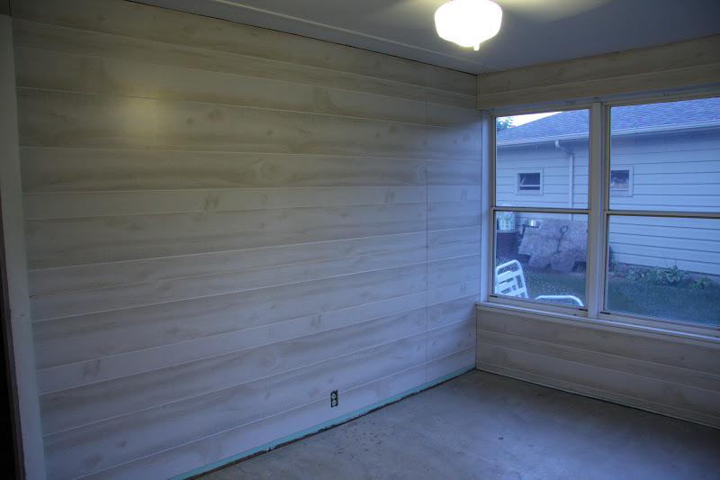

And here's where I painted the floors not once, but twice.  Typical move by me, to be unsatisfied with my first paint choice.  You'll see in this photo how green and nauseating the first color looked (in the center), next to the much more desired gray/brown tone (on the edges).  The guy at Sherwin Williams worked magic to "correct" my partly used gallon so I wouldn't have to pay for a whole new batch.  The color that I ended up with is close to SW Amazing Gray.


Here is where the room is at today.  I love how it feels in there now--so serene and calm. I only have a few accents here and there, but my plan is to keep it neutral, anchored with some black and white and splashes of fresh green.
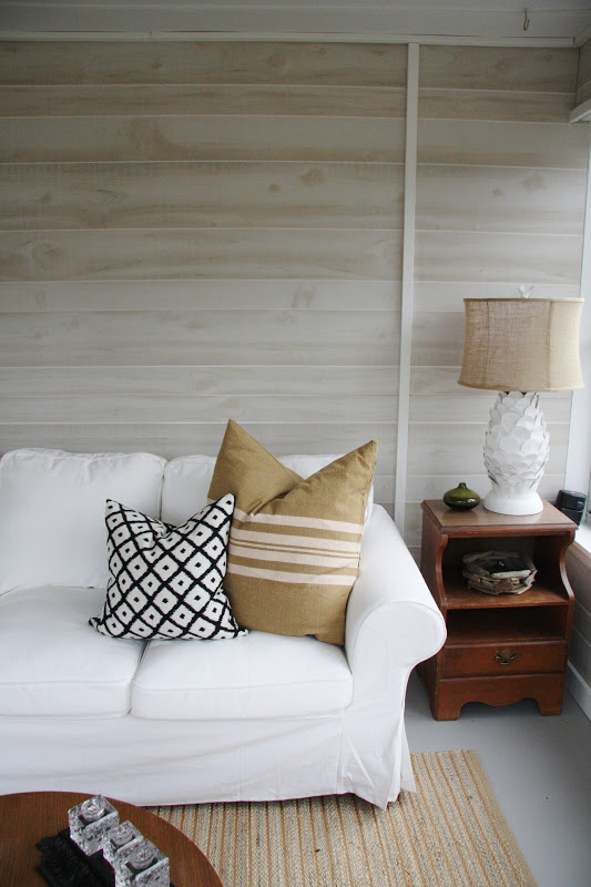

The lamp was a quick little project that I posted about here.  I love how it works within the room!


I've gone back and forth about hanging something above the sofa.  I think what I'd like is to have a sculptural piece that doesn't detract from the "driftwood" walls.  For now though, I'm kind of liking it blank.


So in the next couple of weeks, I'll likely be packing up the pillows and accents, covering the furniture, and saying goodbye to this room until springtime.  Its been lovely having it this season, and hopefully by next summer, I'll have all of the finishing touches complete!

10.01.2012

Homesense Happy

I posted here about a little find from Homesense--all you lucky Canadians out there know of the store I'm talking about.  Here it sits, in its $29.99 glory:


And here it is, available for purchase for $110.00 from Jonathan Adler.  Still flying high about this little acquisition:


I would have been happy forever with my one little piece of Jonathon Adler pottery, so imagine my delight when I opened this up on my birthday last month:


Yep, I got another one!  After my initial score of that gold bowl during my last visit to Canada, my sister in law was on the look out for similar pieces, and actually scored the same one for herself.  Then one night, she called me from Homesense, excited as could be to tell me that she'd found another piece--this one on clearance for $25.00!  I told her to snag it for me right away, and was even more excited to open it up as a gift-wrapped little treasure for my birthday.  Here it is from J.A.:


I don't know how any of this stuff works, or how places like Homesense can get these types of pieces (that are still available at full price elsewhere) and sell them for so cheap, but I'll take it.  Maybe my two little vases have some miniscule imperfection, but they look perfect to me.  Here are a couple more peeks at the shelf flanking my fireplace:


I love owls, and have several (too many) around the house.  The ones I collect are mostly white, but these little treasures are particularly special.  They were on a coffee table at my grandma's house as far back as I remember, and when she moved into a smaller apartment, many of her things needed new homes.  I was happy to take this little family of owls, and they now proudly stand as our little mascots--one for each of us in the house :)

I do promise an overall shot of my fireplace wall, including a look at my new shelves.  Surprisingly, they are completely decorated and styled, and my little guy stays away from them for the most part.  Could be the wall of toys I have as decoys, and as soon as I can move all of his gear long enough to snap a few photos, I'll get them posted.

Happy October!

1.16.2012

Art in the Kitchen

I've been staring at a blank wall in my kitchen for over two years now, tossing around several ideas of what to do with it.  In one of my concept layouts I had cabinetry along that wall, but in the end the design took a different direction and the wall remained as it was.  I know I need to do something there (see photo below--the wall in question is to the left of the fridge), and I think a great piece of art, or arrangement of pieces would look great, but that's where I haven't taken enough time to find the perfect solution.


I think that wall art adds an element of the unexpected in kitchens.  Often in kitchen design, walls are consumed by cabinetry, windows, open shelving, tile, etc., and there is little space left for anything else.  Either that, or kitschy (sometimes cheesy) art prints of food, fruit or wine end up being hung on blank walls to occupy the void.  So is there a happy medium--a place for great artwork in the kitchen that doesn't come across as too literal?  I hope so, because that's what I'm looking for.  Here are some great "art in kitchens" images I found as I started the search:


I absolutely love these prints, and even though they are very literal, their style makes them unique and very appropriate.  I like how they add a modern pop of color to a more traditional setting.

Canadian House & Home

This large floral painting by Bobbie Burgers looks like it was not only planned into the space, but gave inspiration for the design direction as well.  I love how it connects the outdoors, the yellow range, and the rusticity of the island table and makes everything look so cohesive.

Pinterest

Again, this is a literal take on something found in the kitchen, but the application makes it unique.  Its size and scale is unexpected in this tiny kitchen, and the high contrast is perfect with the existing color scheme.

Canadian House & Home

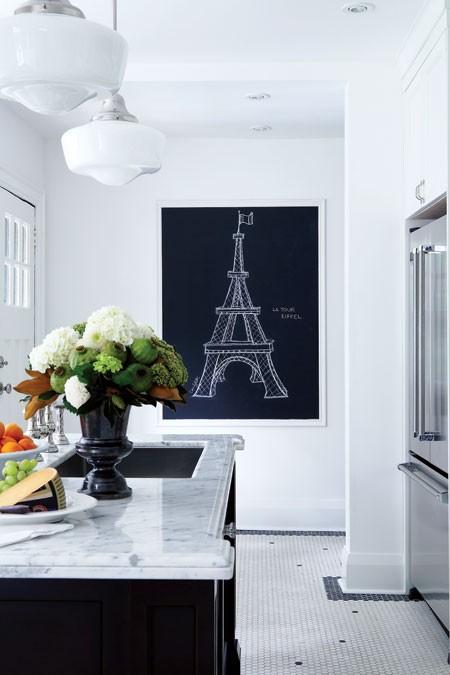
Keeping with the black and white theme, this framed chalkboard looks classy and compliments the kitchen's scheme.  Additionally, it becomes a forever-changing piece of art.  Great idea.


I've tossed around doing a collection of family photos on my blank wall, but thought that there wasn't enough context for it in the space.  However, this dining corner is perfect for the gallery of photos, and I love how the frames are eclectic and carried up over the window.


I've posted this kitchen before--its always been a favorite of mine.  Designed (and lived in) by Canadian designer Lynda Reeves, I like how she's added framed abstract art right next to the range hood, and then repeated it again over a desk in the corner.  The artwork brings a sense of sophistication to the space.

Pinterest

This vintage sign is also a clever idea, and is non-traditional and unexpected in a kitchen space.

There are a ton of ideas out there, and I also did a short search to see what other "unconventional" pieces might be interesting:


Vintage botanical prints


Not-so-vintage (but very affordable) framed botanicals from West Elm


Affordable framed abstracts from West Elm


Original art hardware drawings from Restoration Hardware (there are over 1000 to choose from!)


I also love this vintage eye chart--it would add a nice graphic punch to any wall.

Well, those are my thoughts for now.....I'm not sure I've figured out the perfect solution, but at least I've started thinking about it.  I'm tired of staring at that blank wall!

10.18.2011

Cozy Whites

With the weather getting cooler, I'm already thinking about warming up the house with some winter decor, and I even have a bit of Christmas on my mind.  I can't wait to pull out all of that sparkly goodness!  I love white, but it can seem more "cool" than "cozy" during the winter months.  Check out these pretty little finds though--white and warm.


1.  Ruffly Felt Wreath - Tutorial via Design*Sponge (I WILL be making one of these this season!)


4.  Oversized Cable Knit Throw (almost worth learning to knit so I can make one of these!)


8.  White Pumpkins

9.  Winter Scene--snow covered and cold, but there's something so warm and familiar about a winter frost


I'm not wishing for snow quite yet, but these cozy-cool pieces make me want to string up some white Christmas lights, sip on a cup of warm hot chocolate and curl up with a good design magazine.  How about you?

4.18.2011

Living Room Mood Board

I recently had the privilege of working with a wonderful new client who asked me for help in "casting a vision" for her new living room.  Her and her husband had purchased a home, and after living in it for almost a year, it still isn't feeling like "home" to my client.  She wants to start working, room by room, and have an overall "plan" and vision to work toward.  Great idea, and I got to work creating a floor plan, and a couple of mood boards for her living room and adjoining dining room.


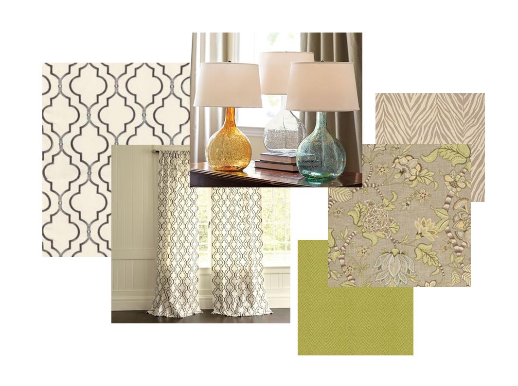
Although the overall scheme looks somewhat "white" in this photo, trust me, for this young family, we're upholstering those pieces in rich, kid-friendly fabrics and colors.  I'm seeing that sofa in a fresh olive green color, with one of the accent chairs in a chocolate microfiber, and the other in a chunky natural linen.  The walls will be painted Sherwin Williams "Amazing Gray", which will provide a lovely backdrop and bring in some of the gray tones in the zebra rug, and floral accent fabric.  For another hit of color, I'm seeing the backs of those shelves painted Benjamin Moore's "Stratton Blue".


My client wanted a scheme that had some personality, but was neutral enough to bring in different color tones throughout the seasons of the year.  I think a warm gray is the ideal backdrop, with the green bringing in a pop of color, but acting as a neutral with the ability to blend with blues, turquoises, ambers, violets, etc., depending on the time of year.


We also chose this gorgeous metallic damask for the adjoining dining room.  It will pair with white paneled wainscotting on the lower half of the walls, and add a hit of glamor and shine.

I'm excited to see this come together, and shop for the "finishing touches" once the room is furnished.  Its hard to show one-of-a-kind finds on these boards, but I think that's definitely what this room needs to pull it all together--a little bit of vintage, and a little bit of modern.  I'll be on the hunt!

4.12.2011

How To Decorate Around a Huge T.V.

We were recently gifted with a beautiful antique buffet by my parents-in-law.  The piece is quite traditional, and I wasn't sure how it would integrate with my more modern decor, but I wanted to give it a try.  I asked my husband to bring the piece over one weekend while I was out of town, and to my delight, when I arrived back, it was sitting in its place in our living room, with little floor protector pads under each leg.  What I didn't notice, however (not right away, anyways), was the GIANT new television that was sitting on top of the piece, perched prominently in our living room.  Obviously, Mr.CottageModern figured that if I got something new for the living room, he should too.  So began the quest to try and "disguise" this black beast, and make that side of the room look nice despite it.  Avoiding the issue, this is what that area has looked like for the past while:


This space had really become a junk collector with a big blank wall behind it.  All of the component cords showing underneath drove me nuts, but that was secondary to the huge television that dominated the arrangement.  Last week, I was a guest presenter to a lovely group of women on the topic of "Designing on a Budget".  One of my budget design principles is to 'shop your own home' to refresh and revive your space, so I decided to take my own advice and do that here.


While the television hasn't magically shrunk in size, now there are some pretty things to "distract" the eye.  I moved the art piece to a new wall, and added a mirror (it had been lying on my floor, in a box for months) to reflect light in its place.  A chair was moved from another area in the room, and pillows were added for an injection of color.


I moved a lamp from another area and placed it on the opposite end of the television.  Together with the art as a backdrop, it adds some weight and height and helps balance the scale of the T.V.  A stack of books, frames, and other collectibles, including a vase from my Ernest Miller pottery collection (my favorite things) help to personalize the arrangement, while trying to take some attention away from the other video components.


Finally, I cleaned up all of the hanging cords, and added some larger pillows and a ceramic stool under the buffet for extra "seating" when guests are over.  I would say that while not "perfect", this area is definitely improved from what it was, and the television is somewhat less of a distraction.  The best part--it all cost $0.00--budget design at its finest!

3.04.2011

Grasscloth Love

Here is the wallpaper I've been living with in my entryway for over a year.  Please don't judge me:


It was underneath another layer of wallpaper, which we managed to peel off, but this stuff is not budging.  We even had two professionals come in and advise us on this, and the general consensus is that as long as the walls themselves are staying, this wallpaper is staying.  Ugh.  In case you need further description, its brown with over-scaled pale green tropical foliage all over.  Maybe in a past life, this was hip, but not today.  And "tropical" in Minnesota is certainly not an appropriate theme.  Not with these frigid temperatures.

Needless to say, I've been looking at these unwelcoming walls for long enough (this stuff covers all of the walls in my entryway and front hall), and I'm excited about recently ordering some beautiful gray-toned grasscloth to cover up the nastiness.  I expected to get it this week, but found out yesterday that its back ordered until mid-April!  I'm so disappointed, but I will wait (I've waited this long, right?).  In the meantime, I've put together a collection of images that inspire me to be patient for what's to come......is there anything more beautiful than this natural texture on a wall?  I love it!


Frank Roop uses this texture beautifully in many of his interiors.  In fact, pretty much everything he touches looks stunning.  Check out his entire portfolio here.


I love how this golden grasscloth shimmers and reflects light.  It is beautifully offset by the white cabinetry and wood tones in this space.  I would love to get work done in this office!


 Go big or go home, right? There's texture everywhere in this space, which helps to cozy up the cool palette.  I love how the grasscloth wraps the ceiling and is accentuated by the white trim.  Gorgeous.


Remember this space?  It was designed by Lonni, a contestant on HGTV's Design Star.  I couldn't get enough of that printed grasscloth wall treatment she used, and thought that this entire room was a success.


This chocolate color adds such a richness to the room.  I want everything in here, including that glorious lacquered sideboard!


This trellis pattern is actually printed on grasscloth......and turquoise grasscloth nonetheless!  Although the material I went with is a lot less expensive than some of these beauties, I'm inspired by the textural spaces, and can't wait to have one of my own.  I'll post pictures when it (finally!) gets done!