A few weeks ago, I found this hideous lamp at HomeGoods. I should say it was hideous to me, but maybe others would have seen its beauty and been able to embrace it in its original state. I didn't buy it right away, but after thinking about it for a few hours, I made my husband wait in the car while I ran in and got it because I was sure that someone else would see its potential and snag it if I didn't. He took one look at the lamp, and said "Yeah, I'm sure people were waiting in line to purchase that pile". Thanks.
Kind of a gross, pinecone-looking base, with an even worse application of several shades of gold and bronze paint. The texture made it even worse, but I loved the burlap shade. Yep, this thing had potential.
A close up of the cob-web texture, but I thought this could be an easy and inexpensive fix, and have a sort of 'paper-mache' look in the end. A few (probably 5 or so) coats of white spray paint later, and this is what I ended up with:
Yay! So much better, and now its a "unique" piece. I think the white base elevates the burlap shade and makes each element stand out.
Now the texture looks intentional, instead of a bad "crafty" spray-on paint job.
The best part is that the lamp will light up the corner of our newly renovated (almost done.....) sunroom! Its the perfect piece for out here, and I can't wait to post more photos--before and afters--of how we transformed this space on a serious dime. Coming soon!
Showing posts with label projects. Show all posts
8.27.2012
8.17.2012
Bananastrudel & My Bathroom
I came across the Etsy shop Bananastrudel when I was working on Tate's Nursery. It is filled with vintage maps, prints, lithographs--you name it. There is a ton of subject matter to choose from, and the shop owners have done a wonderful job curating many beautiful frameable items. I like to visit often because there are always new things popping up. A while back, I found two beautiful botanicals and purchased them right away, knowing I had the perfect spot for them:
They arrived in the mail beautifully and carefully packaged--it was such a treat to open and find goodies and even a handwritten thank you note inside. These guys know customer service!
I've had these framed prints for years and years. I worked in a custom framing shop during college (LOVED that job), and ended up with some nice artwork after my time working there. As for these prints, I liked them at the time because they are sort of architectural, but now I think its kind of dorky that I chose them. I believe that art should be personal and reflect something about us, and I've never been to France or England, so why do I have these hanging on my wall. Good question.
I love the frames with their subtle gold detailing, and although they were custom, they were the exact right size for my Bananastrudel botanicals.
The mats wouldn't work, but I wanted to do something different anyways, so I just mounted the prints on off-white foamcore using some 1/8" thick adhesive foam strips to "lift" them off of the foamcore a bit. Here they are, nicely filling some blank wall space in my newly renovated bathroom (photos of that coming.....hopefully soon):
The prints themselves are of wild buckwheat and wild oats. They remind me of home--Saskatchewan, Canada, where grain farming is abundant.
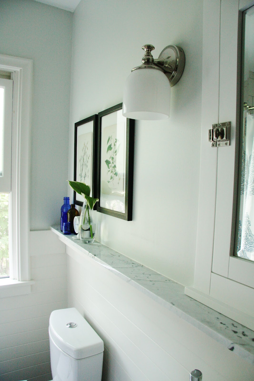
A tiny sneak peek of part of the bathroom. The ledge is Cararra marble, and is wonderful as extra "counter space". The toilet is an Aquia Dual Flush by Toto. Best looking, functioning, and easiest to clean toilet ever, and I recommend it all time. Check out some before shots of this bathroom here, and as I said, a complete reveal is coming soon.
Accessorizing in the bathroom is fun, but things get covered in that dust/towel lint so quickly! This is our primary bathroom right now, and its hard to keep all of the hard surfaces and collectibles dust-free. Especially if you're me, and you haven't figured out why your house seems so dirty all the time and everyone else's seems so clean. Something I wonder about all the time :)
The blue bottles are antique apothecaries that my parents-in-law dug up in a friend's backyard years ago. Quite the find, and I love how they look displayed in a collection. The brown bottles are part of a much larger collection that I amassed while working for many years with my pharmacist dad in his dispensary. I like the history that these things suggest--medicine typically doesn't come in glass bottles anymore.
And for a modern touch, this little clock from West Elm is the perfect size and shape. Took me a while to find something that would work here, and for $12, I'm more than excited about this one!
Have a great weekend!
They arrived in the mail beautifully and carefully packaged--it was such a treat to open and find goodies and even a handwritten thank you note inside. These guys know customer service!
I've had these framed prints for years and years. I worked in a custom framing shop during college (LOVED that job), and ended up with some nice artwork after my time working there. As for these prints, I liked them at the time because they are sort of architectural, but now I think its kind of dorky that I chose them. I believe that art should be personal and reflect something about us, and I've never been to France or England, so why do I have these hanging on my wall. Good question.
I love the frames with their subtle gold detailing, and although they were custom, they were the exact right size for my Bananastrudel botanicals.
The mats wouldn't work, but I wanted to do something different anyways, so I just mounted the prints on off-white foamcore using some 1/8" thick adhesive foam strips to "lift" them off of the foamcore a bit. Here they are, nicely filling some blank wall space in my newly renovated bathroom (photos of that coming.....hopefully soon):
The prints themselves are of wild buckwheat and wild oats. They remind me of home--Saskatchewan, Canada, where grain farming is abundant.
A tiny sneak peek of part of the bathroom. The ledge is Cararra marble, and is wonderful as extra "counter space". The toilet is an Aquia Dual Flush by Toto. Best looking, functioning, and easiest to clean toilet ever, and I recommend it all time. Check out some before shots of this bathroom here, and as I said, a complete reveal is coming soon.
Accessorizing in the bathroom is fun, but things get covered in that dust/towel lint so quickly! This is our primary bathroom right now, and its hard to keep all of the hard surfaces and collectibles dust-free. Especially if you're me, and you haven't figured out why your house seems so dirty all the time and everyone else's seems so clean. Something I wonder about all the time :)
The blue bottles are antique apothecaries that my parents-in-law dug up in a friend's backyard years ago. Quite the find, and I love how they look displayed in a collection. The brown bottles are part of a much larger collection that I amassed while working for many years with my pharmacist dad in his dispensary. I like the history that these things suggest--medicine typically doesn't come in glass bottles anymore.
And for a modern touch, this little clock from West Elm is the perfect size and shape. Took me a while to find something that would work here, and for $12, I'm more than excited about this one!
Have a great weekend!
2.24.2012
Try it Before You Buy It: Chalkboard Wall
Chalkboard paint is widely used right now on anything from accent walls to entire rooms to furniture pieces. Although, I think that this is a passing trend, and that perhaps we'll look back on it someday and wonder what we were thinking, I have yet to come across a home interior with a chalkboard wall or two that I didn't love. In practicality, I'm bothered by chalk dust, and even more bothered by the sound of nails on a chalkboard.....I have shivers right now just thinking about it, but I'm willing to overlook those two major factors because I want some chalkboard action in my own home.
So with all of these great inspirations and examples, I'm now itching try this in my own space. However, I have a track record of painting every room twice because I'm seldom satisfied with my first choice, so I decided that instead of going to the trouble of painting the wall and not liking it, I'd do a little (ghetto) mock up before I commit to the time and effort. Here's the wall in my back entry I'm wanting to paint:
And here's my lame (aka $3 pack of construction paper) attempt at "visualizing" what the black chalk paint would look like:
At first, it was overwhelming to me, but its been up for a few days now, and I'm liking how it kind of brings that wall forward and into the room. Its a large and bossy expanse of black, but I think I need a place that allows me to write messages and reminders in a big and bossy way. The baby takes up most of my brain space these days, so having constant visual reminders of what needs to be done, purchased, dealt with, etc. is key. A trip to the paint store might be in my near future. We'll see........:)
This rustic-modern interior is beautiful, and the injection of a mass of black really sets off the white fixtures and furnishings in the room. How much cooler that the chalkboard itself is actually a huge sliding door? Smart, smart, smart.
The stark stainless and white tones of this kitchen are offset beautifully by the contrasting black wall. Plus, it adds an element of whimsy to this modern, clean lined European kitchen in that the art has an organic and ever-changing element to it.
I love how blogger Carmel of Our Fifth House blog addressed this small section of wall--so creative! And she went the extra mile by using magnetic primer under the chalkboard paint so that the wall could serve in that way as well. I'm considering that as an option myself, since I have a stainless steel fridge that magnets don't stick to. Then I remember that I LOVE the fact that magnets don't stick to and clutter up my fridge, so maybe the magnetic option for this wall isn't for me. We'll see.
A simple and effective way to add interest to a small space.
So with all of these great inspirations and examples, I'm now itching try this in my own space. However, I have a track record of painting every room twice because I'm seldom satisfied with my first choice, so I decided that instead of going to the trouble of painting the wall and not liking it, I'd do a little (ghetto) mock up before I commit to the time and effort. Here's the wall in my back entry I'm wanting to paint:
And here's my lame (aka $3 pack of construction paper) attempt at "visualizing" what the black chalk paint would look like:
At first, it was overwhelming to me, but its been up for a few days now, and I'm liking how it kind of brings that wall forward and into the room. Its a large and bossy expanse of black, but I think I need a place that allows me to write messages and reminders in a big and bossy way. The baby takes up most of my brain space these days, so having constant visual reminders of what needs to be done, purchased, dealt with, etc. is key. A trip to the paint store might be in my near future. We'll see........:)
Labels:
projects
1.30.2012
Entryway Progress: My Top Wallpaper Choices
With the entryway disaster behind me, I'm moving forward to get the walls in that space corrected and looking fabulous. Thanks for all of your comments--I have renewed hope for grass cloth, should I go that route again. Since I've been looking for the right wall treatment for some time, I revisited some of my original choices as I went back to the drawing board in search of a wall covering.
If money were no object........
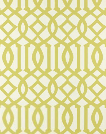
Imperial Trellis in Citrine would be my number one choice. Everyone loves this pattern--in fabric and wallpaper--and I'm no exception. Maybe its the graphic pop, or the combination of curvy and straight lines, or maybe its the striking repetition of pattern--whatever it is, this design is so interesting, and I love the acid green-against-white colorway.
I also came across this trellis pattern, which would be a great second choice to the Imperial Trellis:
Unfortunately, the paper itself is "thinner" than I think it should be for the condition of our walls. We've patched them as necessary, but I feel I need something with more thickness to hide the imperfections I'm not seeing. See more patterns and colorways from this collection here.
In my search, I came across this and was drawn to it because of the light silver-gray color and overscaled pattern:
I took a quick photo when I was at the store, and neglected to write down the brand. Needless to say, while I love the pattern and subtlety of the color, it has a metallic sheen to it that I think I'd get tired of too soon.
So after looking through countless wallpaper books, and really adoring so many of the graphic, colorful and interesting patterns out there, I feel like I just can't commit to anything too trendy for my entry and stairwell area. If I was considering changing it out again in a few years, I'd definitely take the plunge and do something more fun, but since that's not the plan (WAY too many other house projects chewing into the budget), I'm back where I started......still wanting my grass cloth.
This photo shows the two new samples I found that are closest to what I have on some of the walls (my current grass cloth is the background). The weave of the new ones is a bit more course, but I don't mind the added texture. I think the top one is the one that will work best as it leans more toward a green-gray than a purple-gray like the bottom one.
Grass cloth adds so much glorious texture to this room, designed by Frank Roop, and plays well with the other textures going on in the space.
So with all of the many books and patterns I've looked at (and there have been a ton), I'm sorry to say that I'm not more of a risk-taker with pattern and color. However, I need to go with what I know I'll love in the long run, and my plan is to get the stuff on order this week!
If money were no object........
Imperial Trellis in Citrine would be my number one choice. Everyone loves this pattern--in fabric and wallpaper--and I'm no exception. Maybe its the graphic pop, or the combination of curvy and straight lines, or maybe its the striking repetition of pattern--whatever it is, this design is so interesting, and I love the acid green-against-white colorway.
I also came across this trellis pattern, which would be a great second choice to the Imperial Trellis:
Unfortunately, the paper itself is "thinner" than I think it should be for the condition of our walls. We've patched them as necessary, but I feel I need something with more thickness to hide the imperfections I'm not seeing. See more patterns and colorways from this collection here.
In my search, I came across this and was drawn to it because of the light silver-gray color and overscaled pattern:
I took a quick photo when I was at the store, and neglected to write down the brand. Needless to say, while I love the pattern and subtlety of the color, it has a metallic sheen to it that I think I'd get tired of too soon.
So after looking through countless wallpaper books, and really adoring so many of the graphic, colorful and interesting patterns out there, I feel like I just can't commit to anything too trendy for my entry and stairwell area. If I was considering changing it out again in a few years, I'd definitely take the plunge and do something more fun, but since that's not the plan (WAY too many other house projects chewing into the budget), I'm back where I started......still wanting my grass cloth.
This photo shows the two new samples I found that are closest to what I have on some of the walls (my current grass cloth is the background). The weave of the new ones is a bit more course, but I don't mind the added texture. I think the top one is the one that will work best as it leans more toward a green-gray than a purple-gray like the bottom one.
Grass cloth adds so much glorious texture to this room, designed by Frank Roop, and plays well with the other textures going on in the space.
So with all of the many books and patterns I've looked at (and there have been a ton), I'm sorry to say that I'm not more of a risk-taker with pattern and color. However, I need to go with what I know I'll love in the long run, and my plan is to get the stuff on order this week!
Labels:
Home decor,
projects
1.24.2012
Entryway Progress & Grasscloth Disaster
It was discovered underneath another layer of paper that we immediately peeled off when we moved in. This layer, however won't budge. We've tried everything and even called in experts to have a look, and the verdict is that its not coming off. In addition to that, the walls aren't in great shape, so I've been considering several options. Either skim coat the entire entry and stairwell and prep the walls for paint, or cover it in a beautiful wall covering. Wall covering it is--grass cloth to be exact. I searched high and low for an affordable grass cloth, and when it seemed like I wouldn't find what I was after, I stumbled across the perfect color (and price) at Lowes of all places. Its a gorgeous gray color, and nice and neutral with no weird undertones. Plus, it has a very fine weave, and looks like a lot of the expensive grass cloths I've found in high end books. After waiting five months for it to arrive (it was backordered), we had it installed last fall right before the baby was born. As soon as it started going up, I loved it. This photo isn't the best, but its an idea.
However, shortly into the process, things started to go wrong. Keep in mind that all the correct adhesives were used, and the method for hanging used by my (experienced) installers was careful and meticulous.
I hope you can tell from the photos that every seam is completely bleached out and horribly visible. While I understand that one of the interesting characteristics of grass cloth is that the seams are visible once its installed, this was not the kind of "visible" that I was used to seeing, and obviously a product failure. What's more, not only were the seams bleached, random patches in the middle of a sheet had lost color as well:
And the worst area:
Needless to say, after this started happening to literally every sheet that was hung, we stopped mid-process, and now the project is half done. Lowes was great about it, and offered to replace all of the rolls I purchased with new ones if we wanted to start over and "hope for the best" with a new batch. I was ready to take them up on this, and then found out that the product had been completely discontinued! So back to square one. Its now almost been a year since I started the process and I still have ugly walls in my entry, plus 40% of the walls covered in faulty grass cloth that has to be removed.
The silver lining? I recently found several great new options for wall covering for the entry, and am ready to make a decision and get the project back on track. I'll post my findings this week, and hopefully make a decision and get something ordered very soon.
Has anyone ever run into this problem with grass cloth before? Its such a beautiful product, and so hot right now that I'm sure I can't be the only one. Hopefully the second time is a charm with this project!
Labels:
Home decor,
My house,
projects
10.15.2011
Still Workin'
Since the baby's due date came and went and the little guy forgot to show up, I'm trying to find ways to keep my mind off of the fact that I'm still pregnant. The nursery is almost complete, but there are a few finishing touches that I want to try to get done if at all possible. I mentioned in this post that the nursery bedding was initially a disappointment because it was so blue, compared to the aqua/turquoise colors that I was going for. In the end, everything is tying together beautifully, and I wanted to continue bringing together the two shades of blue I'm working with.
For drapes, I would have loved to go with full patterned panels, but I needed to keep this economical and use what I had on hand. I've been hanging on to this aqua geometric for a long time, and I wanted to make it work in this room.
To stay on budget, I bought these inexpensive panels and took the tabs tops out because I plan on using ring clips to hang the side panels.
Since I had limited yardage of the fabric and wanted maximum impact, I decided to sew 12" strips down the outside edge of each panel. There are 2 windows in the room, so there's nice opportunity for some "hits" of this fabric.
Here's some photos of the fabric after I attached it to the panel--very basic sewing skills folks--nothing but straight lines and uncomplicated patterns. I added a grosgrain ribbon to trim out the inside edge and bring in the blue tones found in the bedding.
At the end of it all, to my delight, I had just the right amount of fabric to piece together this pillow cover--complete with some fun orange ball fringe--for the room. I'll have photos of the completed space soon, and hopefully some even more exciting news to share.....:)
For drapes, I would have loved to go with full patterned panels, but I needed to keep this economical and use what I had on hand. I've been hanging on to this aqua geometric for a long time, and I wanted to make it work in this room.
To stay on budget, I bought these inexpensive panels and took the tabs tops out because I plan on using ring clips to hang the side panels.
Since I had limited yardage of the fabric and wanted maximum impact, I decided to sew 12" strips down the outside edge of each panel. There are 2 windows in the room, so there's nice opportunity for some "hits" of this fabric.
Here's some photos of the fabric after I attached it to the panel--very basic sewing skills folks--nothing but straight lines and uncomplicated patterns. I added a grosgrain ribbon to trim out the inside edge and bring in the blue tones found in the bedding.
At the end of it all, to my delight, I had just the right amount of fabric to piece together this pillow cover--complete with some fun orange ball fringe--for the room. I'll have photos of the completed space soon, and hopefully some even more exciting news to share.....:)
Labels:
Children's Decor,
My house,
Nursery,
projects,
Turquoise
3.23.2011
My Favorite One-Year-Old
As I mentioned in my previous post, I had the honor (and fun) of being a part of my niece's first birthday party last week. I'm pretty sure that the terrible cold/flu bug I caught during my trip up to Canada was care of Delta airlines, but being with family made this sickness I've been struggling with for the past few days worth it.
I was really excited for one of the gifts I had for my little niece. I'd worked on creating it for a while before her birthday, and am so pleased with how it turned out. I have to say that the idea for the piece was not my own, so credit is due to this talented lady for inspiring the project.
I started with a color palette that I knew would complement my niece's nursery.....the hope was that the piece would turn out nice enough to hang there!
Then I decided on a phrase that could be repeated and fit the letters of her name within it. I used the phrases "I am a child of God" and "Jesus loves the little children" and strung them together to create the lettered background I needed. Then I got to work cutting out all the letters with my Cricut.
I used a white linen fabric for added background texture on the letters. And voila!.......the finished product:
I love how it turned out, and the simple white frame and large mat set of the "art" quite nicely.
Most importantly, it was a huge hit at the party, and although I'm sure my sweet niece had no idea what was going on (or that this piece had her name on it!), my brother and sister-in-law love it.......and I think they even plan on hanging it in her room :)
I was really excited for one of the gifts I had for my little niece. I'd worked on creating it for a while before her birthday, and am so pleased with how it turned out. I have to say that the idea for the piece was not my own, so credit is due to this talented lady for inspiring the project.
I started with a color palette that I knew would complement my niece's nursery.....the hope was that the piece would turn out nice enough to hang there!
Then I decided on a phrase that could be repeated and fit the letters of her name within it. I used the phrases "I am a child of God" and "Jesus loves the little children" and strung them together to create the lettered background I needed. Then I got to work cutting out all the letters with my Cricut.
I used a white linen fabric for added background texture on the letters. And voila!.......the finished product:
I love how it turned out, and the simple white frame and large mat set of the "art" quite nicely.
Most importantly, it was a huge hit at the party, and although I'm sure my sweet niece had no idea what was going on (or that this piece had her name on it!), my brother and sister-in-law love it.......and I think they even plan on hanging it in her room :)
Labels:
Children's Decor,
projects
Subscribe to:
Posts (Atom)
.jpg)
.jpg)